Charts
After defining your custom metrics, you can customize how they will be displayed on Custom Device and Custom Device group pages. To customize custom metric charts, edit the plugin JSON ui section and the chart definitions.
UI section in plugin.json
"ui": {
"charts": [
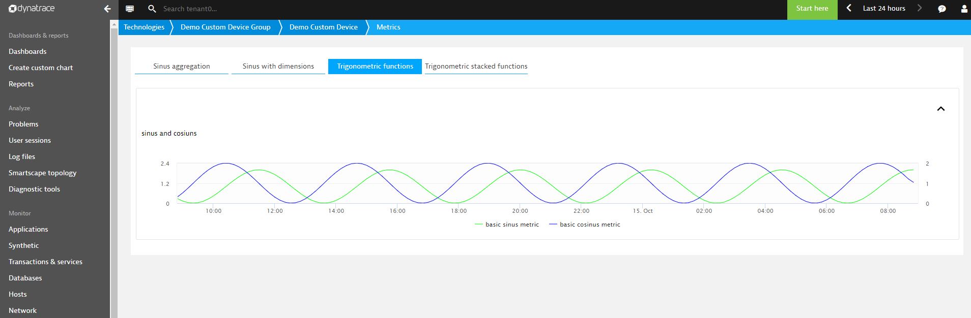
{
"group": "Trigonometric functions",
"title": "sinus",
"series": [
{
"key": "baseSin",
"aggregation": "avg",
"mergeaggregation": "avg",
"displayname": "basic sinus metric",
"seriestype": "line",
"color": "#00ff00",
"rightaxis": false,
"stacked": false
},
{
"key": "baseCos",
"aggregation": "avg",
"mergeaggregation": "avg",
"displayname": "basic cosinus metric",
"seriestype": "line",
"color": "#0000ff",
"rightaxis": true,
"stacked": false
}
]
},
{
"group": "State",
"title": "State metric",
"series": [
{
"key": "state_metric",
"displayname": "State",
"statecolors": ["#008cdb", "#5ead35", "#e6be00"],
"statechart": true
}
]
}
],
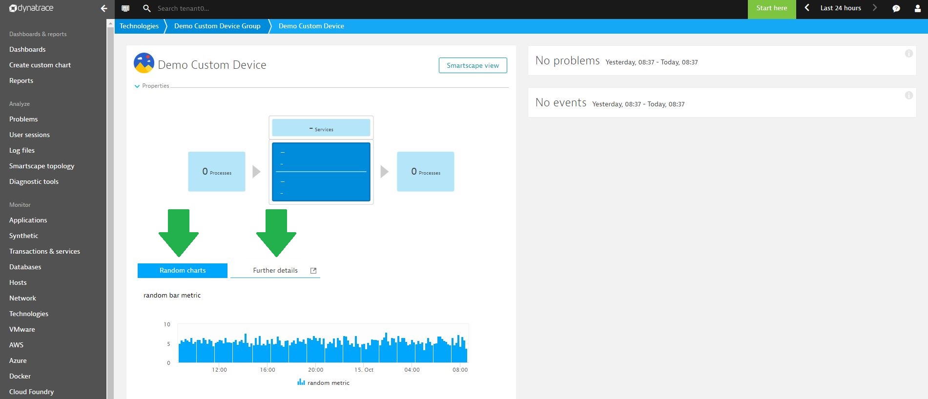
"keycharts": [
{
"group": "Random charts",
"title": "random bar metric",
"series": [
{
"key": "random",
"aggregation": "avg",
"mergeaggregation": "avg",
"displayname": "random metric",
"seriestype": "bar",
"color": "#00ff00",
"rightaxis": false,
"stacked": false
}
]
}
]
},
"metrics": [
{
"timeseries": {
"key": "random",
"unit": "Count",
"displayname": "random key metric"
}
},
{
"timeseries": {
"key": "baseSin",
"unit": "Count",
"displayname": "basic sinus metric"
}
},
{
"timeseries": {
"key": "baseCos",
"unit": "Count",
"displayname": "basic cosinus metric"
}
},
{
"statetimeseries": {
"key": "state_metric",
"states": ["state1", "state2", "state3"],
"displayname":"Battery status"
}
}
]
}
First, define the single chart series. Remember to match key field with the key value defined in timeseries definition in the metrics section. Next, add your series to the charts definitions. Note that you can use any series in one chart. You can also title your charts, distribute them in groups, and clarify where they are found.
Chart definitions have to go into charts or keycharts arrays. Every group defined in keycharts will appear as a tab in the Entity details view, and groups defined in charts section will be placed inside them Further details tab.
You have the following presentation options:
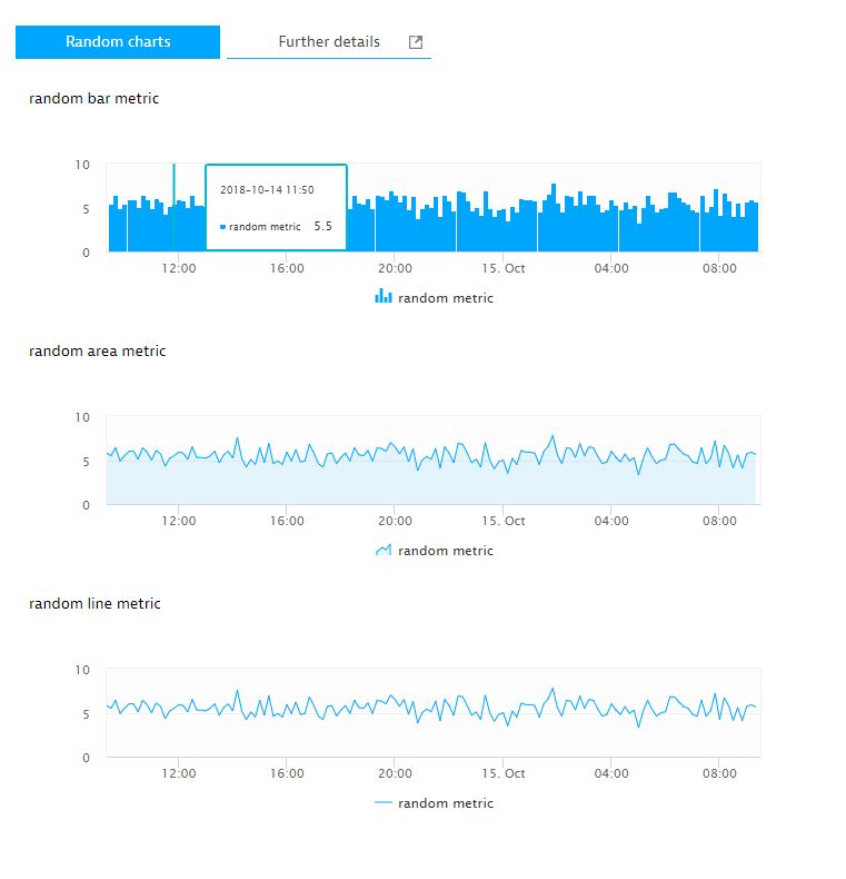
Different series types
You can choose between three series types: line, bar or area. All three charts below presents the same metric using different series type.
Multiple series on one chart
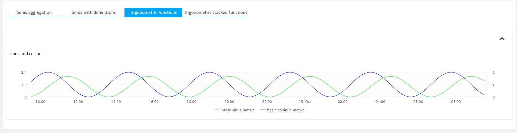
You can use many series in one chart. You can move the axis values to the right for particular series by setting rightaxis field to true.
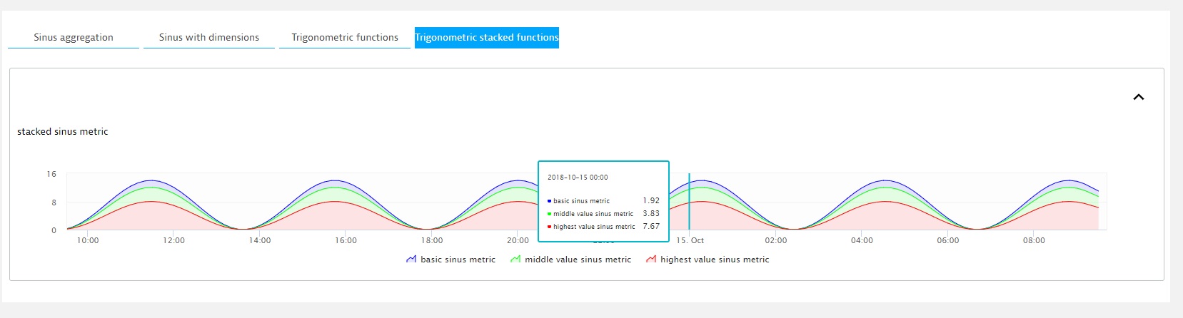
Stacked series
You can also stack series. Set the stacked field to true. The red series in the image represents a function with highest value and the blue one with the lowest.
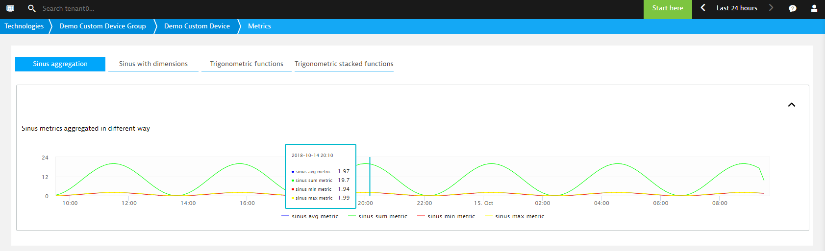
Aggregation
Aggregation defines the method to aggregate the minute values when working in a longer timeframe. Possible values are: sum, avg, min, max. See the differences in values of each serie when viewing charts in a 24-hour timeframe. Note that sum aggregated series has higher value than others.
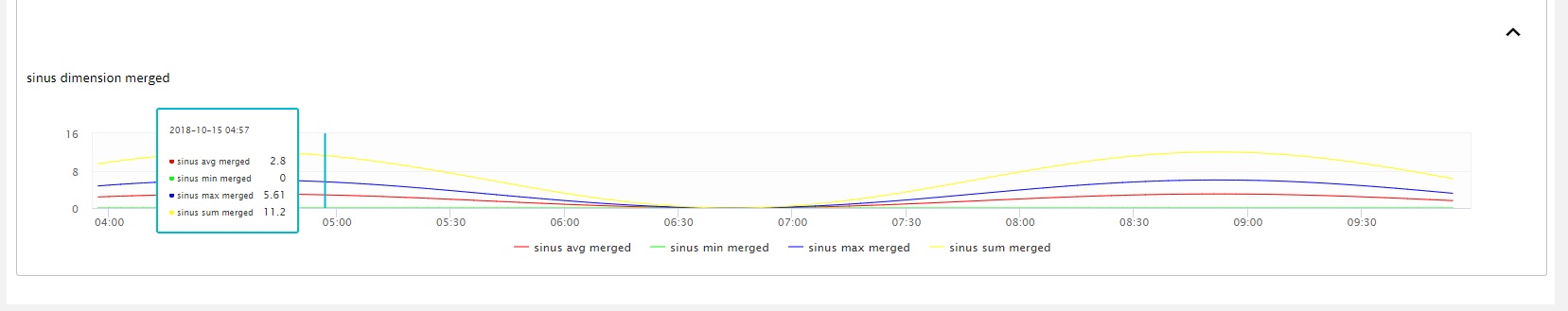
Mergeaggregation
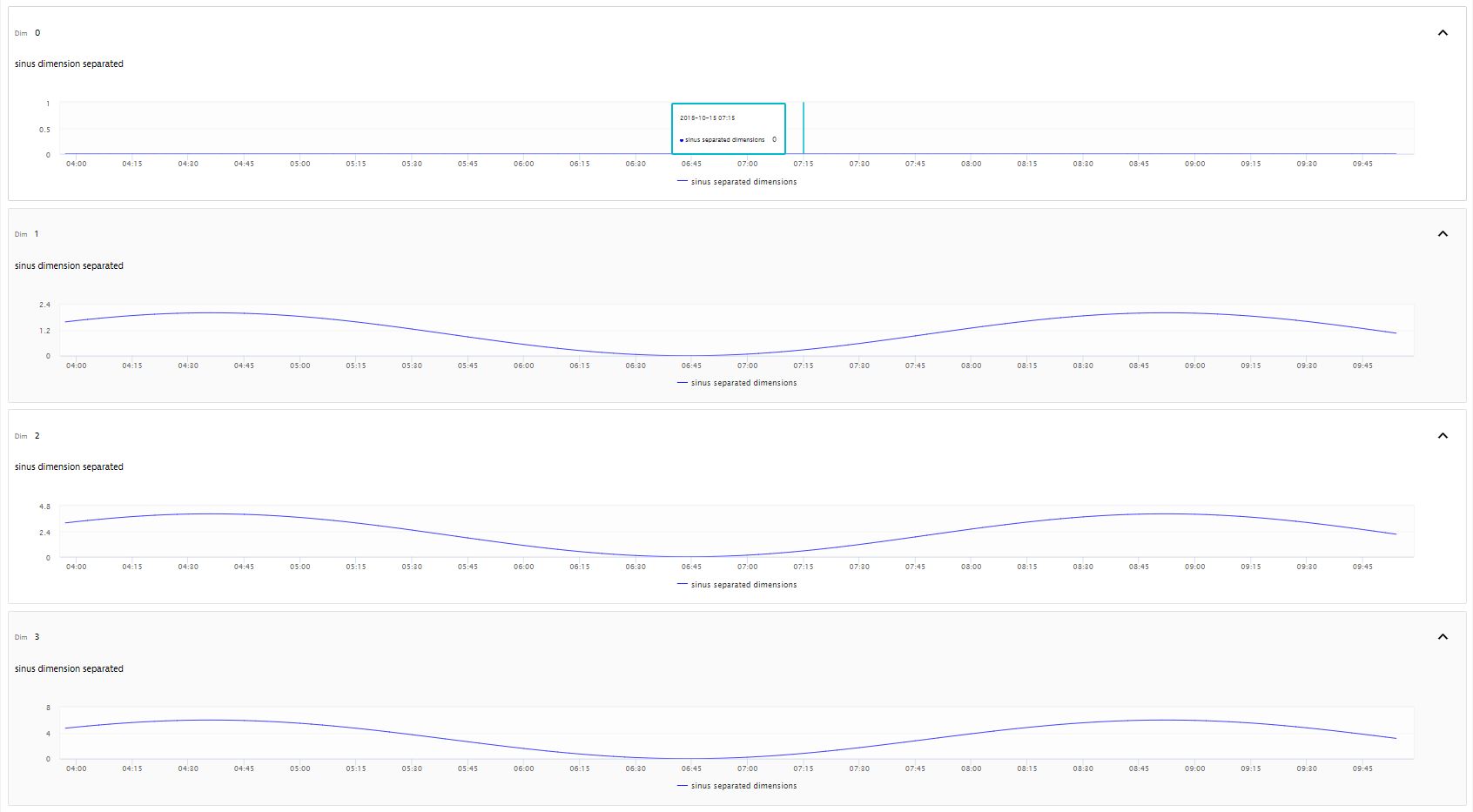
If your metric contains multiple dimensions, you can aggregate them into one chart. Mergeaggregation defines how to aggregate the dimension values into a single dimension. Possible values are: sum, avg, min, max. First have a look at the metric segmented by four dimensions, then see the result of mergeaggregation.
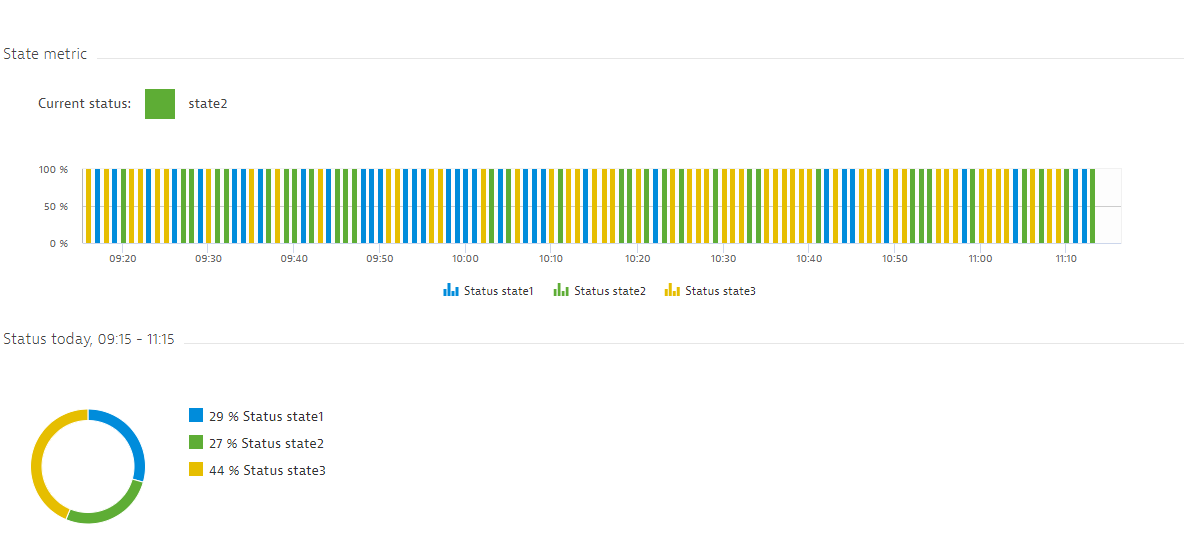
State charts
You can also define charts using the state timeseries. This results in a bar chart presenting the number of states per timestamp and a pie chart presenting the percentage of particular states in a selected timeframe. The key state chart presents the sum of states across all the dimensions. Note that a single chart can't contain both numeric and state timeseries.