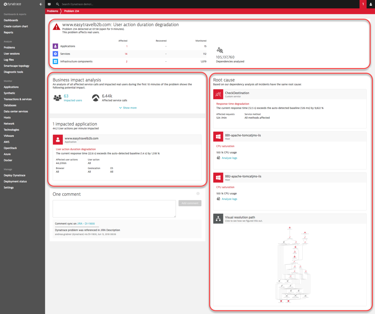
Problem overview page
Each problem overview page is comprised of three main sections (see example below):
- The top section includes counts of the number of Applications, Services, and/or Infrastructure components that are affected by the problem.
- The impact analysis section on the left includes details about the direct consequences of a problem. It may also provide information about the business impact of a problem.
- The Root cause analysis section on the right includes details about the underlying root causes of the problem.
Access problem overview pages
To access problem overview pages
- Select Problems from the navigation menu.
- From the Problems page, select the problem you want to analyze.
Problems with red icons are active problems while problems that feature gray icons are closed problems. You can alternatively access the Problems page by clicking the Problems tile on your home dashboard.
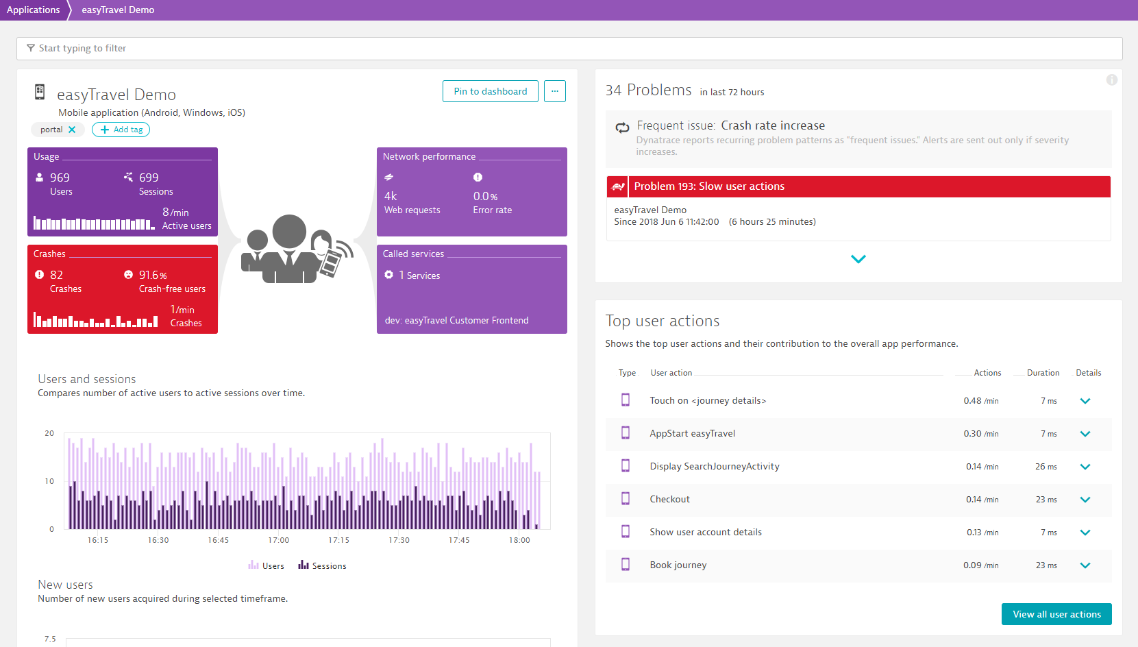
Problem overview pages can also be accessed from individual entity pages (see the easyTravel Demo application example below). Active problems are indicated in red. Closed problems aren't displayed by default. Closed problems can be viewed by clicking the expand button (arrow icon) at the bottom of the Problems section.
Click any problem listed on an entity page to navigate to the problem's overview page.
Navigation within the context of a problem
Once a problem is detected, the problem overview page provides a quick summary of the affected components at the top of the page (see example below).
To begin detailed code-level analysis of a detected problem, click an affected component (see callout in the Requests contributing to this problem section in the example below).
As you progress through the provided analysis, you remain within the context of the detected problem. The analysis timeframe remains constant so that you can understand everything that happened in your environment during the time leading up to and during the problem (see the analysis timeframe in the upper-right corner in the example below). In this way you can analyze metric values and enabled filters that were active during the problem timeframe (see below).
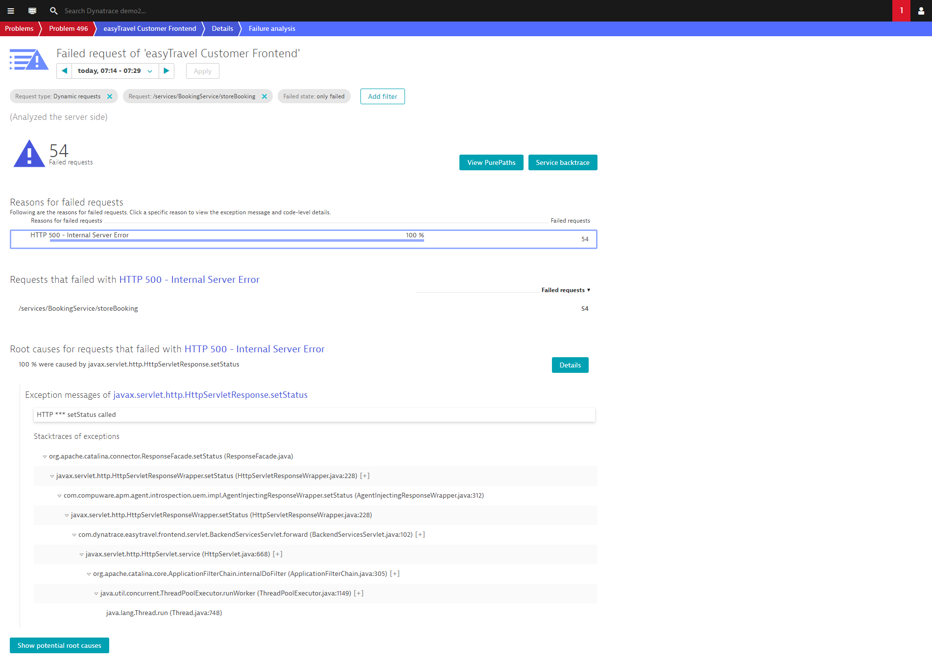
The problem header summarizes what Davis (the DESK AI causation engine) detected on this selected component and the red marked parts of the page show which metrics and service methods are still outside the normal mode of operation. In the example below, some service methods recovered more quickly than others and are marked in green.
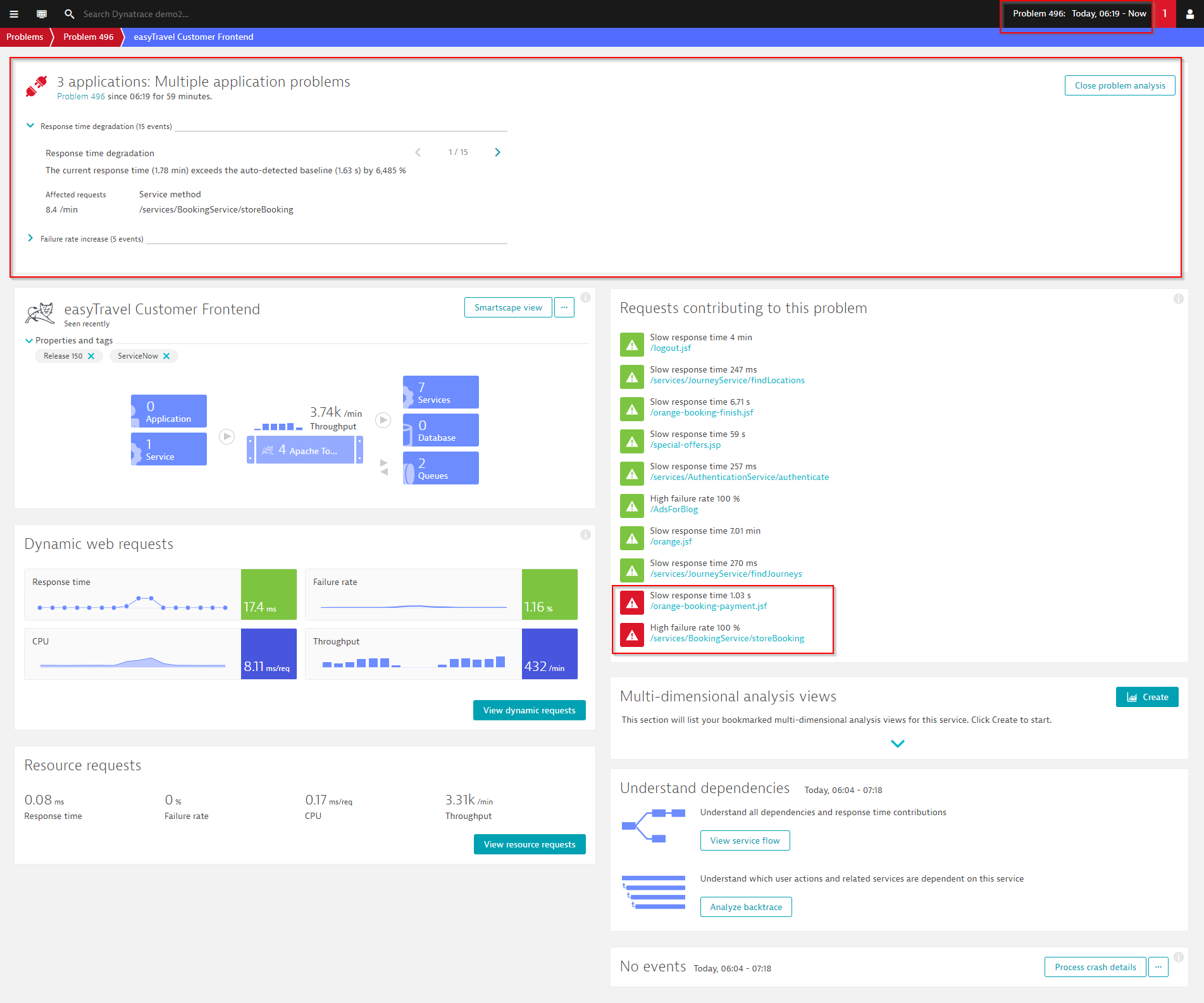
Because all information about a detected problem can’t be shown on a single page, DESK guides you by providing such navigational hints. For example, a click on the High failure rate 100% hint on the service method services/BookingService/storeBooking (see above) results in the display of a chart of all the failing requests of that specific service method during the problem timeframe.
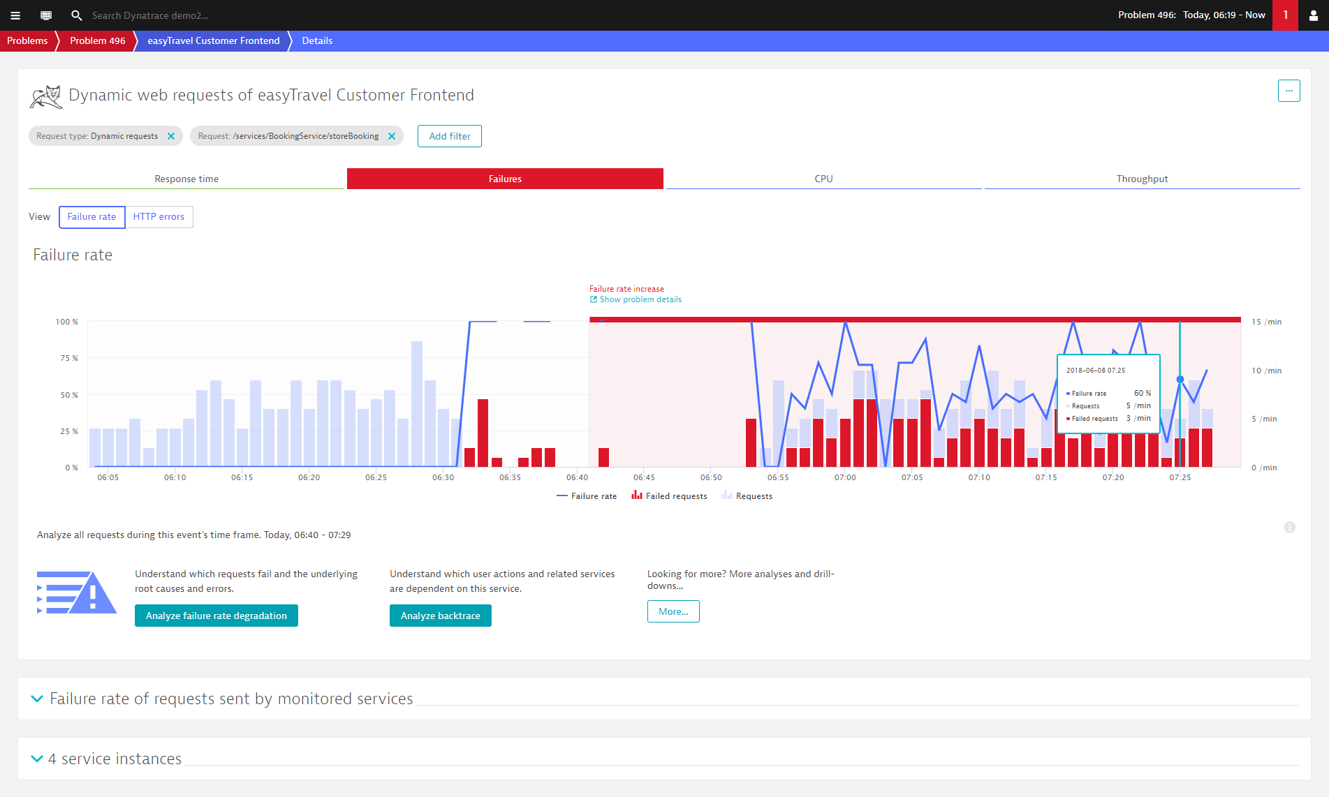
Click the Failure rate chart to analyze all the errors that preceded the problem.