Performance analysis
The Performance analysis section displays a number of performance metrics for your application. Just expand the Performance analysis section of the infographic on the application overview page to view the performance analysis options.
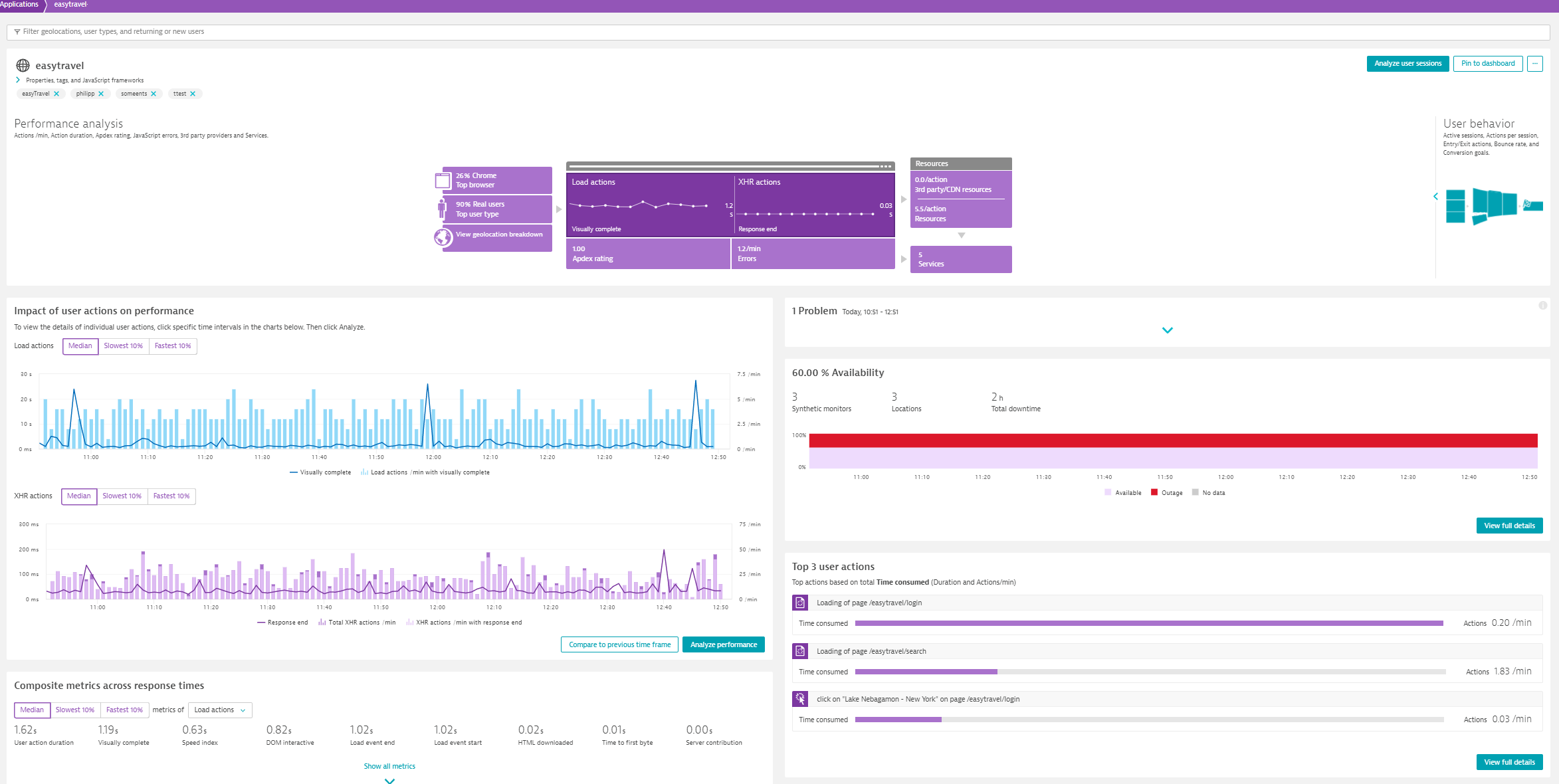
Working with the infographic
Each area of the infographic appearing at the top is clickable, offering access to deeper detail regarding each metric. Whenever you click a part of the infographic, the left section right below the infographic shows different data that reflect the selected part.
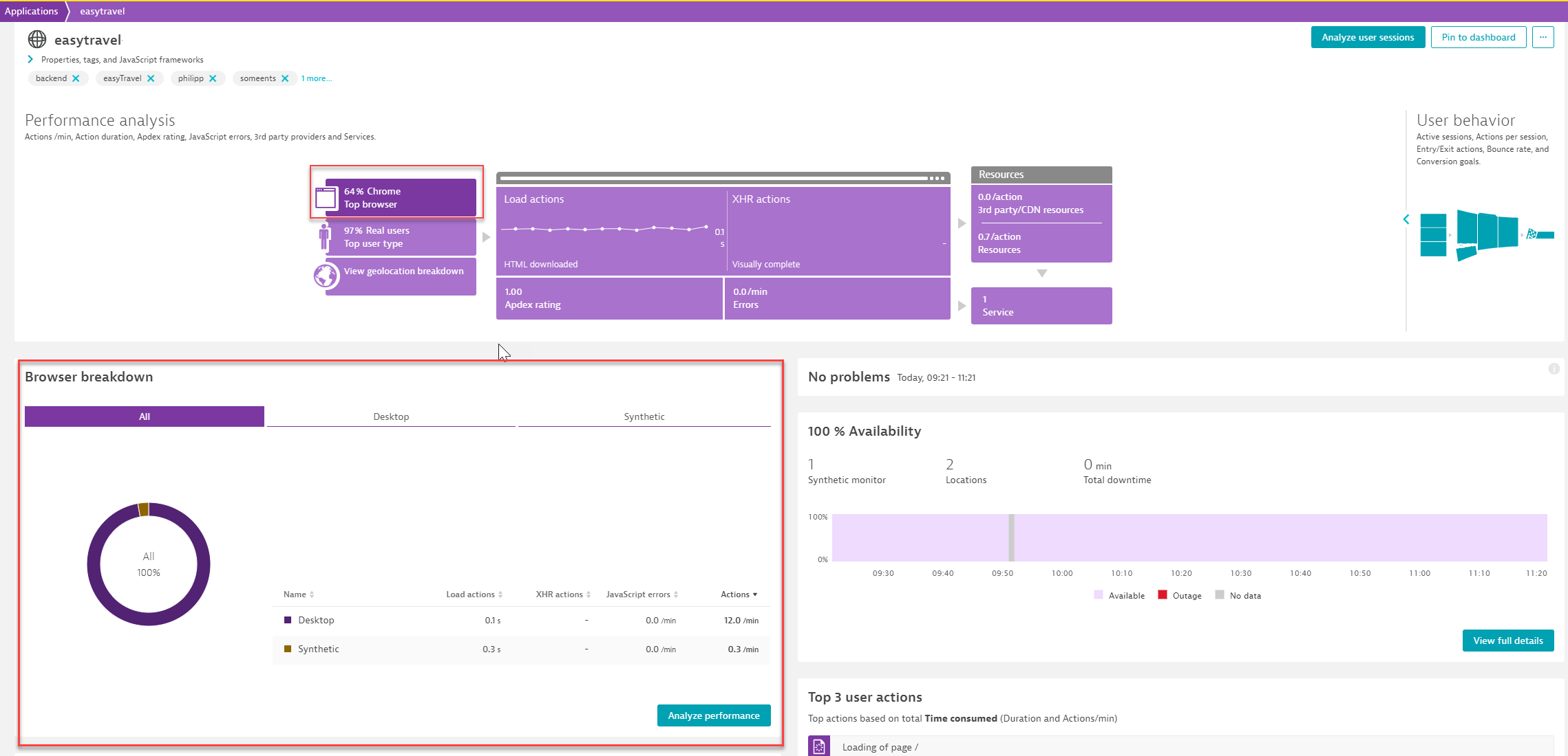
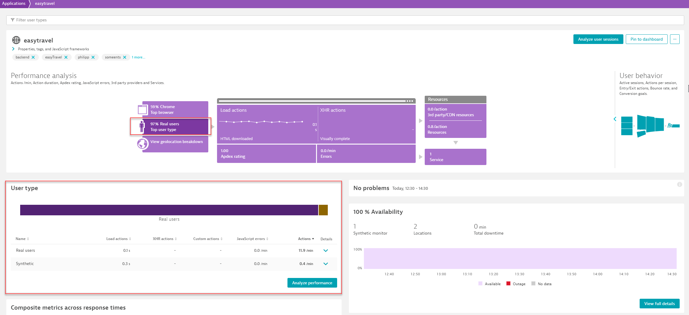
The left-hand portion of the performance analysis infographic shows dimensional breakdowns of your application traffic based on browser type, user type, and geographic region. In the middle, you can see the different action types, the Apdex rating and the errors section, while on the right-hand side, the resources and the services sections are displayed. The top finding for each dimension is displayed by default in each section. The discrete infographic sections are briefly described below.
If you click the Top browser section of the infographic, you will see the Browser breakdown on the left under the infographic. This shows the traffic per desktop browser, mobile browser, synthetic, and more.
By selecting Analyze performance in the bottom right corner of the Browser breakdown section, you navigate to the multidimensional analysis page, where you can perform a multidimensional analysis from the Browsers perspective.
By selecting Top user type, in the User type section under the infographic, you can see the number of actions per minute, Load and XHR actions, and JavaScript errors of Real users versus Robots (for example, Googlebot), and Synthetic. The bar appearing at the top of the User type section, is a visual representation of this breakdown.
By selecting Analyze performance in the bottom right corner of the Browser breakdown section, you navigate to the multidimensional analysis page, where you can perform a multidimensional analysis from the User type perspective.
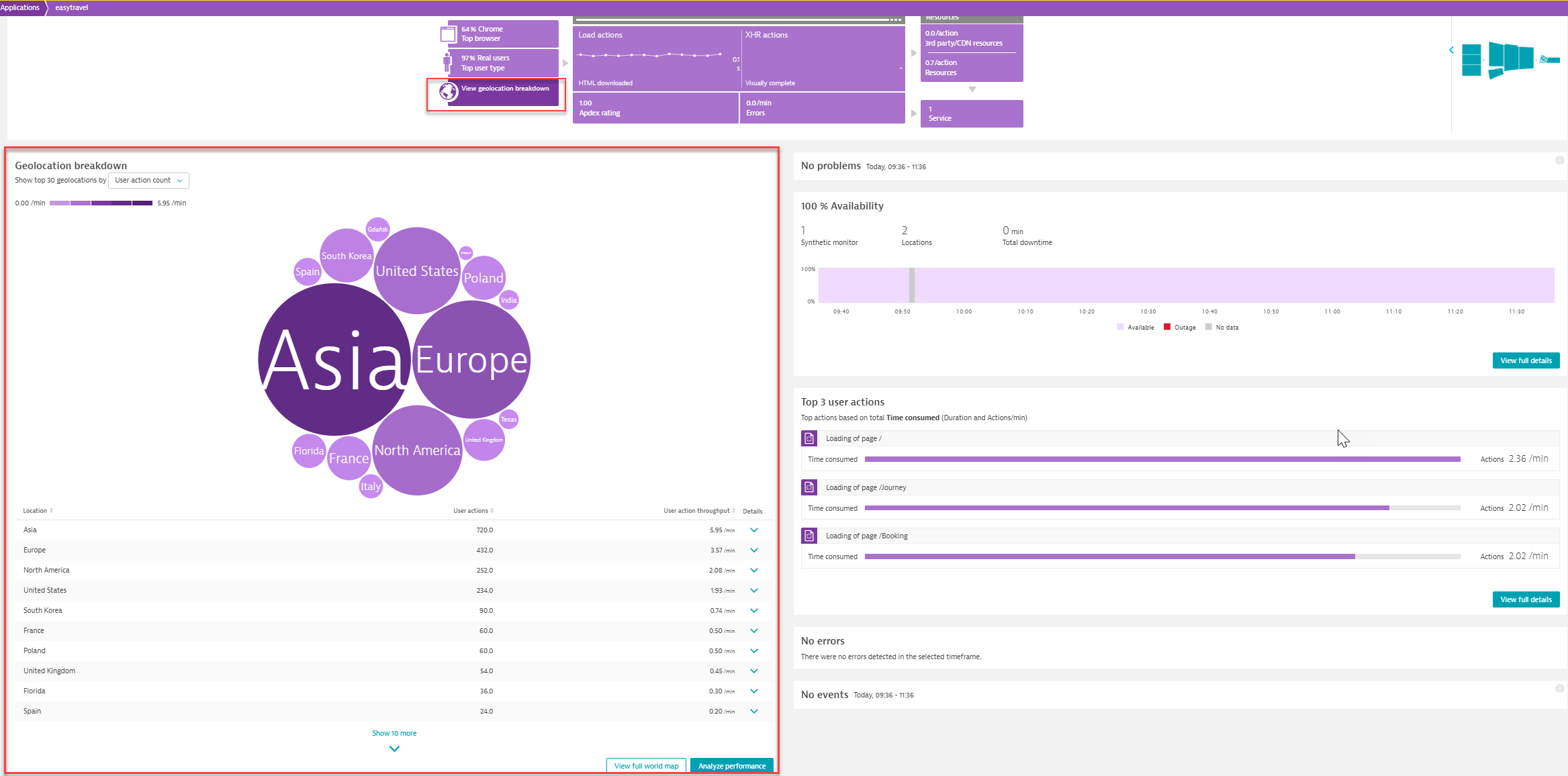
By selecting Geolocation breakdown you can view the geographical locations that have the highest traffic. You can view further details on the world map that you can access by clicking View full world map.
By selecting Analyze performance in the bottom right corner of this section, you navigate to the multidimensional analysis page, where you can perform a multidimensional analysis from the Geolocations perspective.
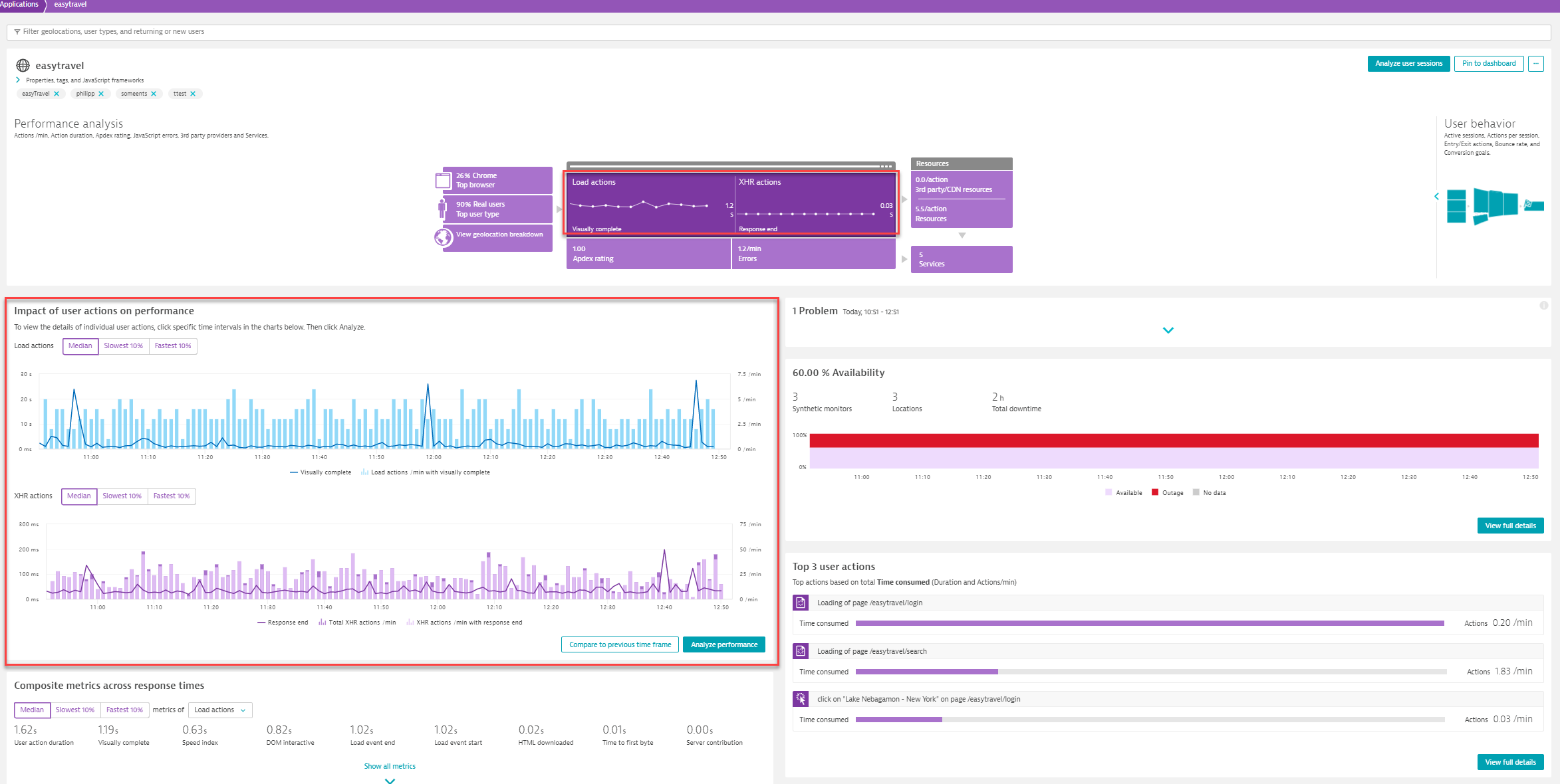
User actions are divided into Load actions and XHR actions (or custom actions if available).
If you click the user actions part of the infographic, you can view the Impact of user actions on performance. The charts displayed show among other things, the Visually complete metric for load actions and the Response end for XHR actions.
You can also use the metric selector to display either the Slowest 10%, Median, or Fastest 10% of user actions.
By selecting Analyze performance in the bottom right corner of this section, you can analyze your application’s performance and user actions across multiple dimensions.
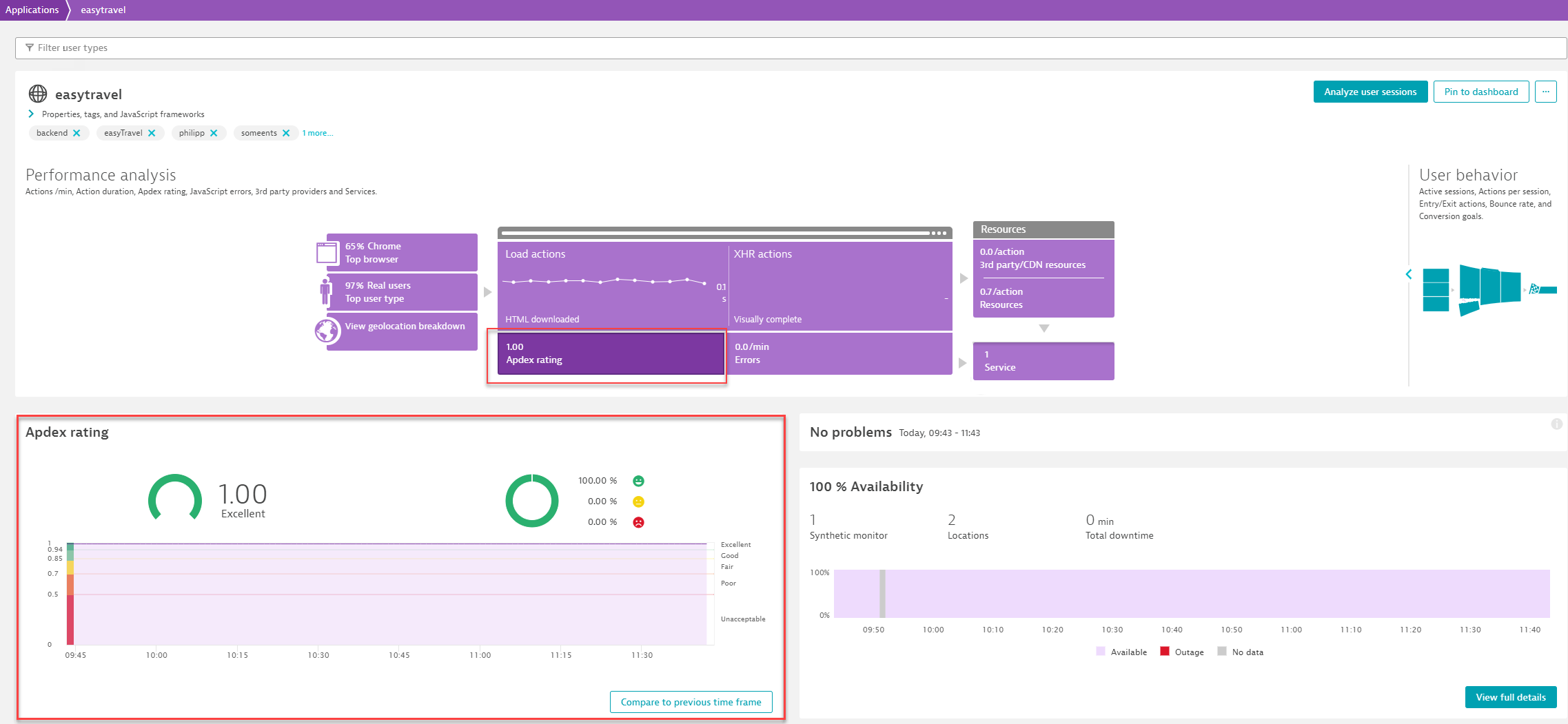
DESK relies on Apdex ratings to calculate user satisfaction with specific applications. By selecting Apdex rating, you can view the user satisfaction within the specified time frame.
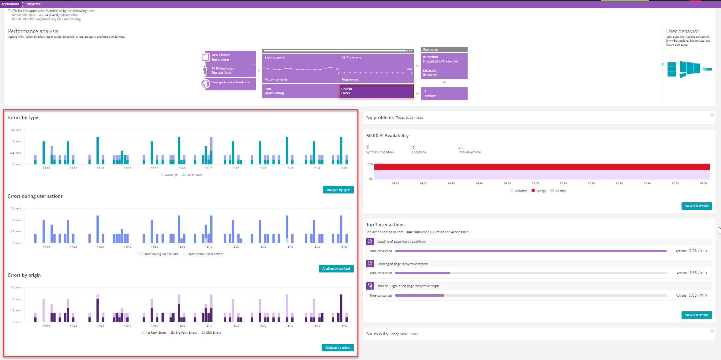
Select Errors to view error analysis from three different dimensions, error type (JavaScript vs. HTTP errors), context (within a user action or in-between a user action) and origin (whether they originate from 1st party, 3rd party, or CDN). If you click the button in the bottom right corner of each chart, you will navigate to the multidimensional analysis page, where you can perform a multidimensional analysis from the Errors perspective, combined with the type, context or origin dimension respectively.
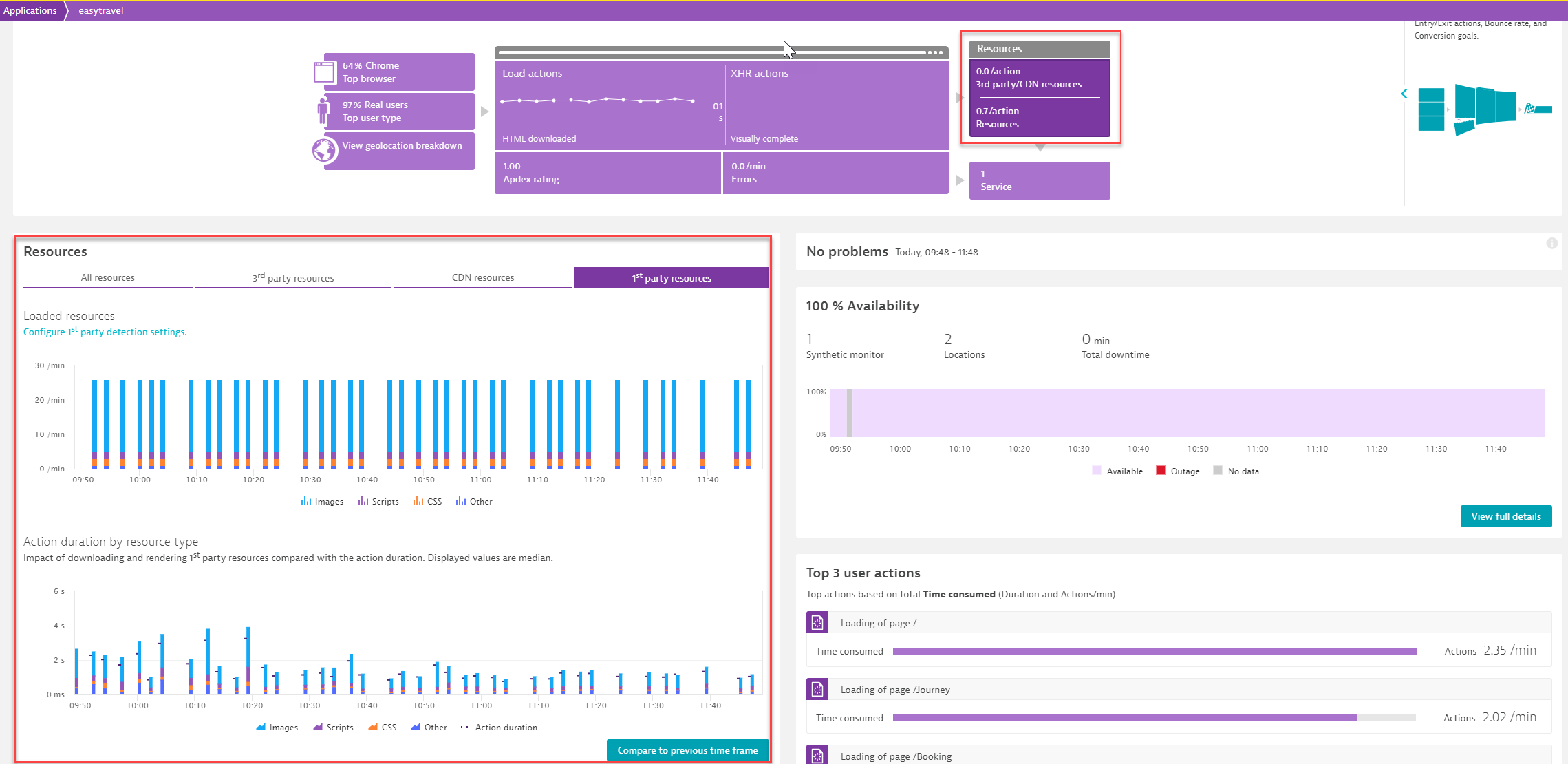
Click Resources in the infographic to view details regarding the resources that your application relies on. DESK uses the provider host names of downloaded resources to categorize content resources into either 3rd party resources, CDN resources, or 1st party resources. You can examine the action duration by resource type and also compare it to a previous time frame.
In the 1st party resources tab, you can also look for trends in your internal resources—Scripts, Images, and CSS resources are tracked and reported separately.
From this section, you can also navigate to the provider detection settings where you can manually add a provider.
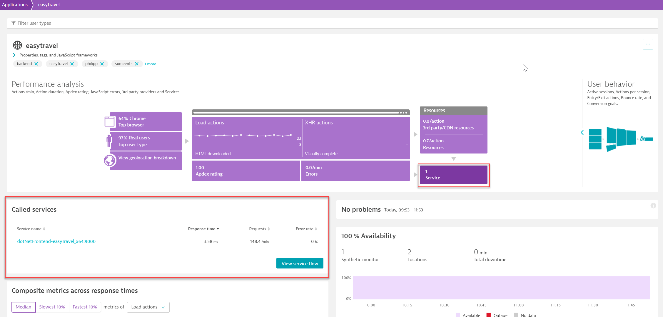
Click the Services portion of the infographic to view the services that support your application in the Called services section. If you click View service flow at the bottom right corner of this section, you can view the sequence of service calls that are triggered by each service. DESK allows you to access the service flow for an application as well as a user action.
Application availability
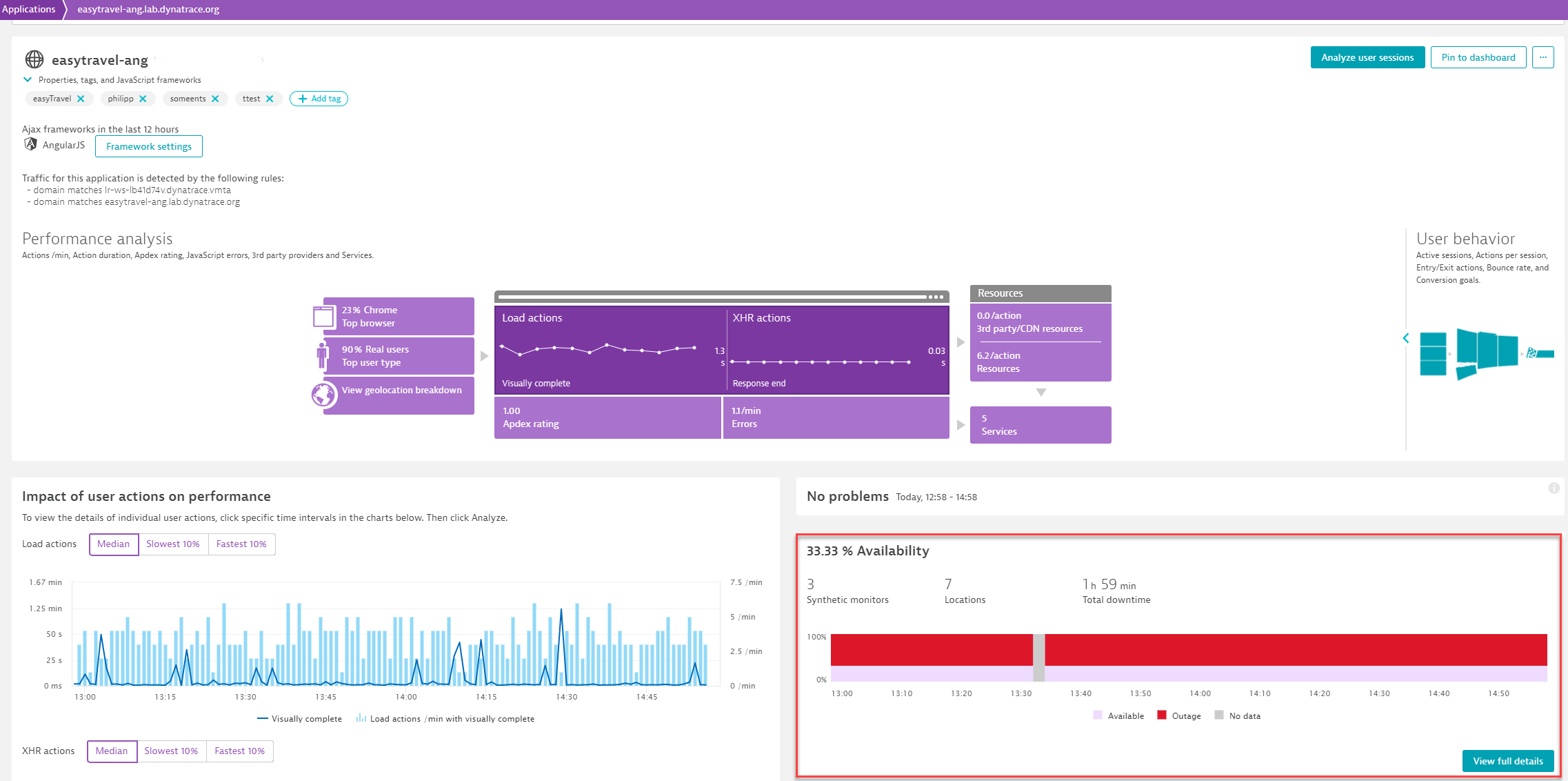
If you have one or more synthetic monitors set up to test the availability of your application, you can see the availability of your application directly on the application overview page within the Availability section. The availability chart shows you an aggregate view of all of the selected application's synthetic monitors. You can click the View full details button to view details related to outages and navigate directly to synthetic monitor details (your analysis timeframe settings will remain intact) to perform further analysis.
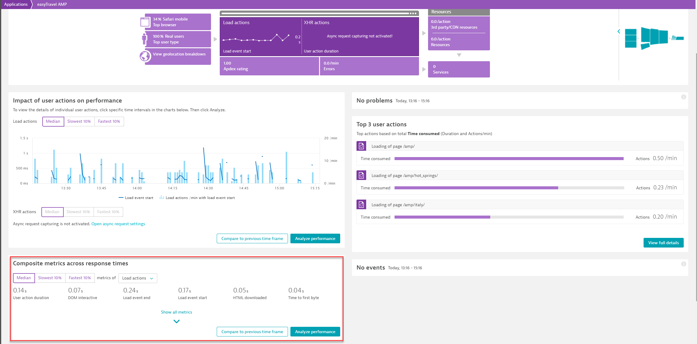
Composite metrics across response times
This section helps you figure out from a high level perspective where your performance focus should lie. You can identify, for example, whether the duration up to the time to first byte is an issue for your application or you should focus on user perceived loading performance, indicated by Speed index and Visually complete.
If you click Analyze performance in the bottom right corner of this section, you can analyze your application’s performance and user actions across multiple dimensions.
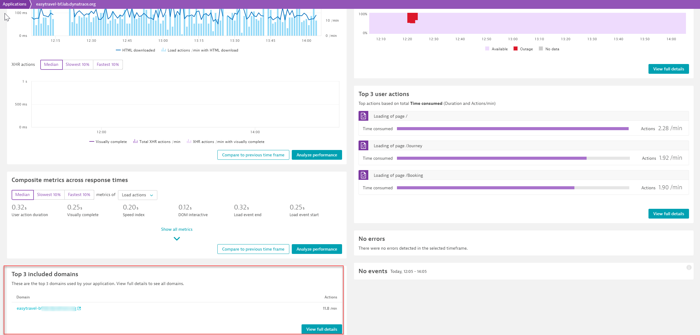
Top 3 included domains
At a glance, you can see the Top 3 included domains, i.e. the domains that contain the largest number of actions that have been automatically detected by OneAgent in your environment. You can click View full details to view more details on the traffic coming from these domains and to define new applications.
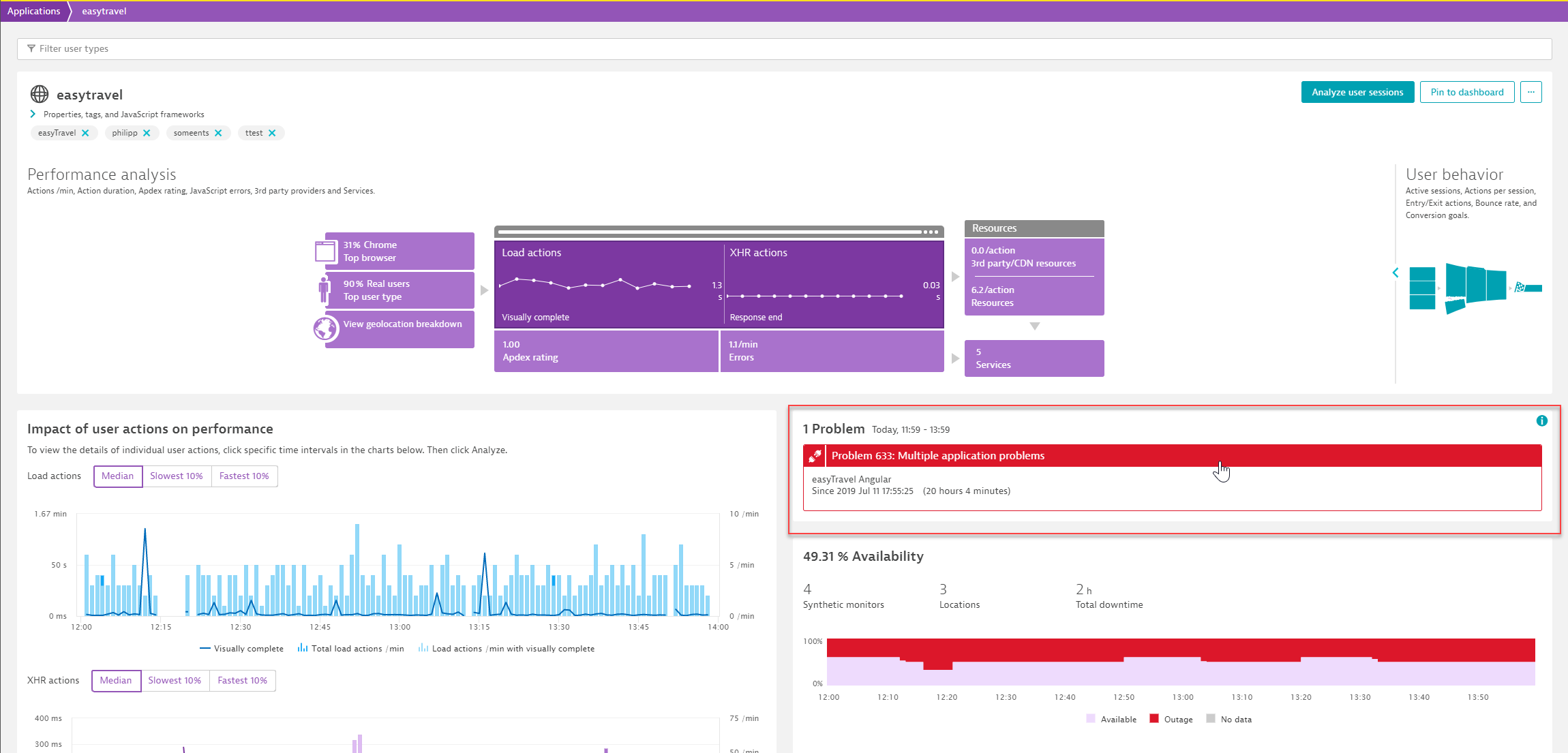
Problems
The Problems section indicates problems that have been automatically detected by Davis, the DESK AI engine. Just click on a problem to learn further details.
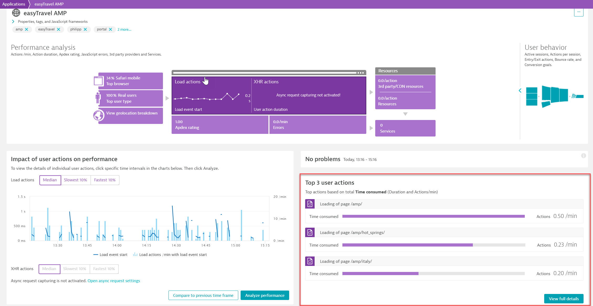
Top 3 user actions
The Top 3 user actions list shows you the 3 slowest user actions. Actions are sorted based on priority (high priority actions are listed first) and total time consumed (duration multiplied by number of actions). The total time consumed measure is valuable because it factors in how frequently an action is called. For example, a slow action that is called often has more significant impact on performance than a slow action that is not called often.
If you select a user action, you navigate to the user action overview page where you can further analyze the specific user action.
If you click View full details in the bottom right corner of the section, you can analyze your application’s performance and user actions across multiple dimensions.
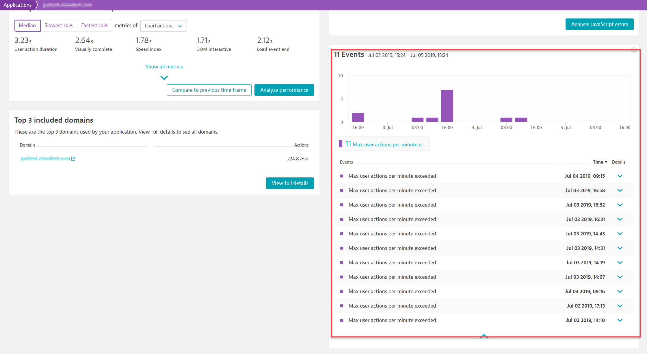
Events
Events represent system incidents that occurred and may be of interest to you. Such events include, for example, errors, new version deployments of your application, configuration changes, and more. The events shown in the image below were generated because the maximum number of user actions per minute was exceeded.