Multidimensional analysis for browser monitors
The Multidimensional analysis page graphs performance, availability, and error count over the selected timeframe. You have the ability to select a shorter analysis range and view the individual data points in a scatter plot as well as in list format. The top of the page shows long-term (timeseries) data, followed by the scatter plot and individual data points for up to 35 days from the current time. For data points, you can view waterfall graphs for actions and error details, if any.
DESK multidimensional analysis enables you to analyze monitor executions along multiple filtering dimensions.
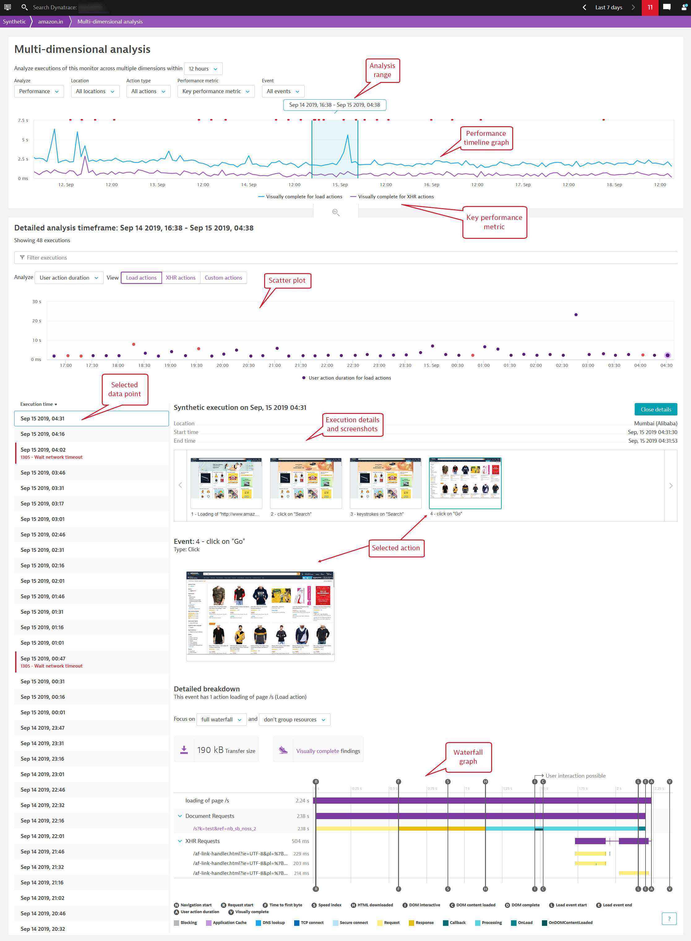
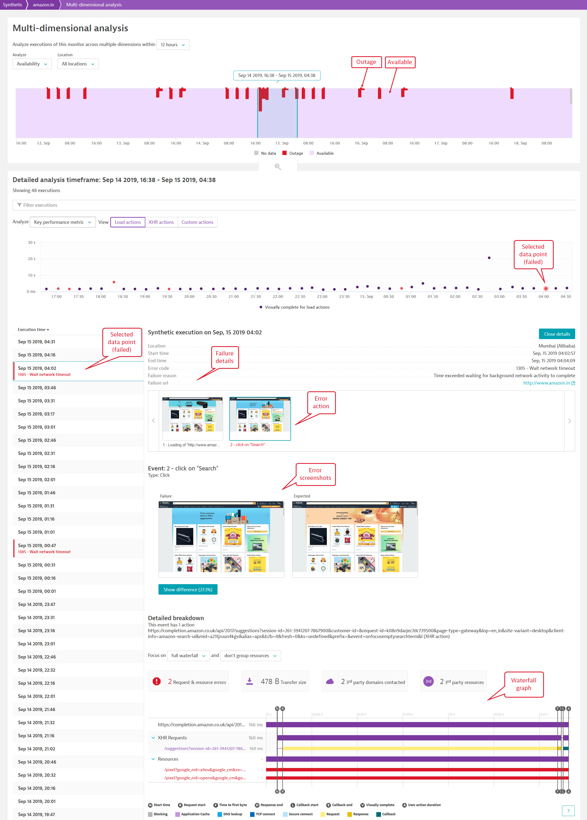
For each data point, you can see screenshots for all events; waterfall graphs are available for actions (events with timings).
You access the Multidimensional analysis page by drilling in from various points on the Synthetic details page.
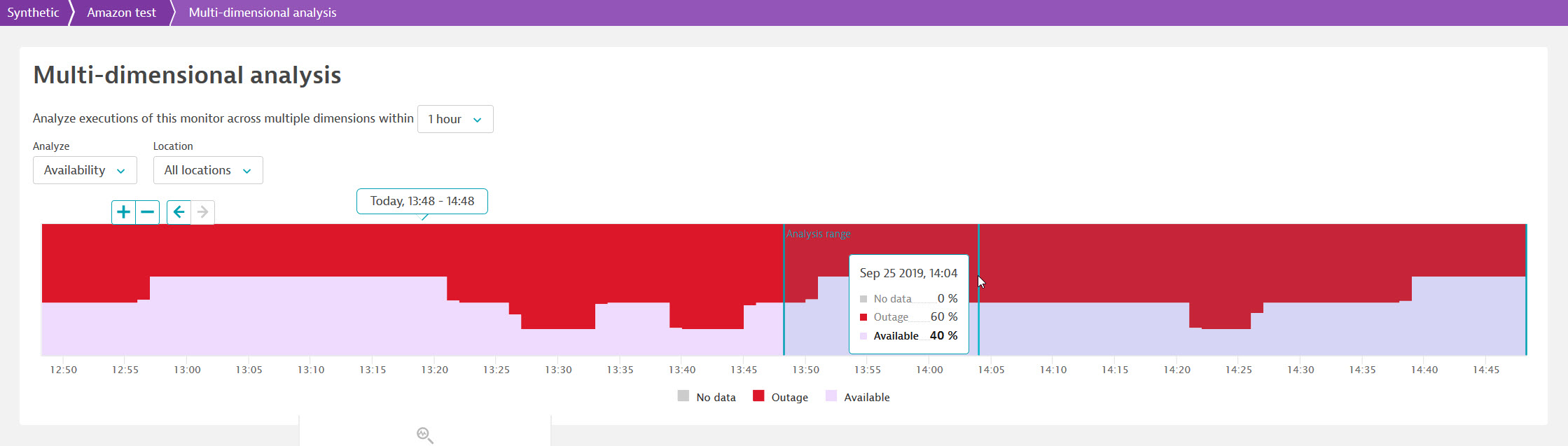
Analysis range
Whether you're looking at availability, performance, or errors, the shaded area in the graph represents the analysis range, which is a subset of the timeframe. Click elsewhere in the graph to move the analysis range; the scatter plot and list of data points are filtered accordingly.
When you hover over the graph, you see arrow buttons  that you can use to adjust the timeframe forward and backward in time, say from 10:30-12:30 to 08:30-10:30. Note that the size of the timeframe and analysis range remain the same.
Use the zoom buttons  to adjust the timeframe by zooming in (+ = shorter timeframe) or zooming out (- = longer timeframe). The size of the analysis range is correspondingly adjusted when you use the zoom buttons—you can also use the drop-down menu to change the analysis range.
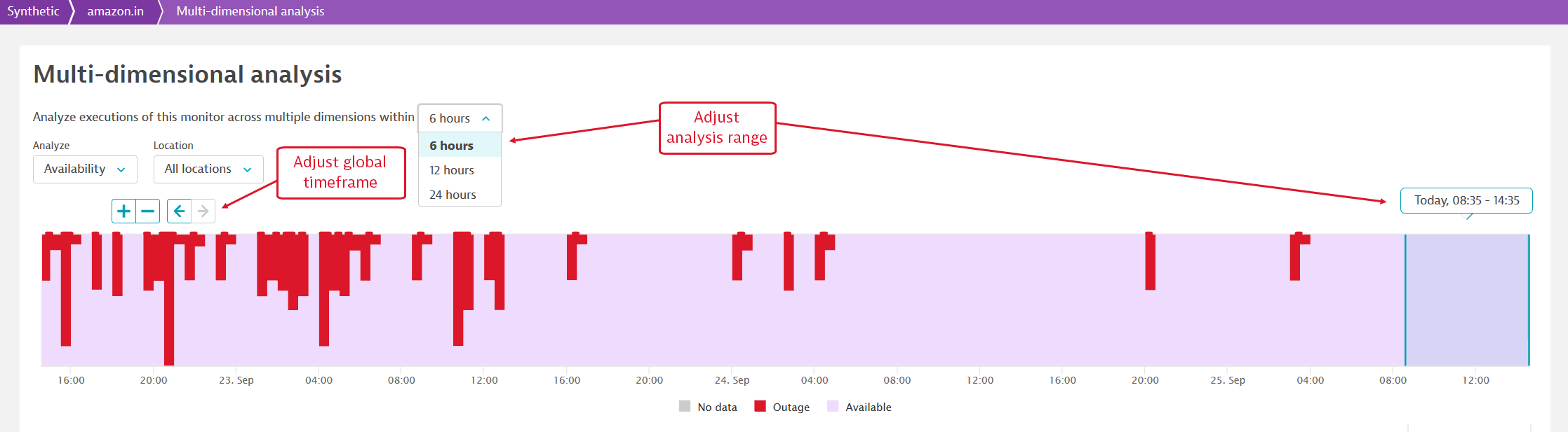
Analyze availability
When you click Analyze availability on the Synthetic details page, you're directed to the Multidimensional analysis page, which shows an availability trend graph for all your monitoring locations.
When you click a specific location in the Synthetic details page, you're directed to the Multidimensional analysis page filtered by that location.
Multidimensional analysis for availability includes the option to filter the graph (and the corresponding scatter plot and data points) to view information for All locations or for a single monitoring location.
Hover over any point in the graph to see availability details for that point in time.
Red-shaded areas represent outages—the width of the area represents outage time while the height represents outage percentage. Outages are periods of time with error data points, or failures. Note that monitor errors don't lead to problems if they don't violate your availability thresholds or if you haven't enabled thresholds.
Analyze performance
You can access the Multidimensional analysis page for performance data from the Synthetic details page in a few different ways.
- Click Analyze performance to view a performance trend for all your monitoring locations. Your action type selection from the details page (load actions, XHR actions, or all events) carries over to the Multidimensional analysis page.
- Click a specific location on the details page to view performance analysis filtered by that location.
- Click Analyze next to an expanded action in the Synthetic events and actions card to see a graph for that particular action across all locations. The action type, for example, Load actions, is automatically selected.
Your default key performance metric selections carry over to the Multidimensional analysis page—you can, however, change this (see below). Hover over any point in the graph to see the performance of the key performance metrics for that point in time.
Besides viewing performance over an analysis range, you can opt to view the data points during a problem. A red line above the performance graph represents the duration of a problem. Click the line to view the problem type; click the link provided to navigate to the related problem overview page. All data points for the problem duration are automatically displayed.
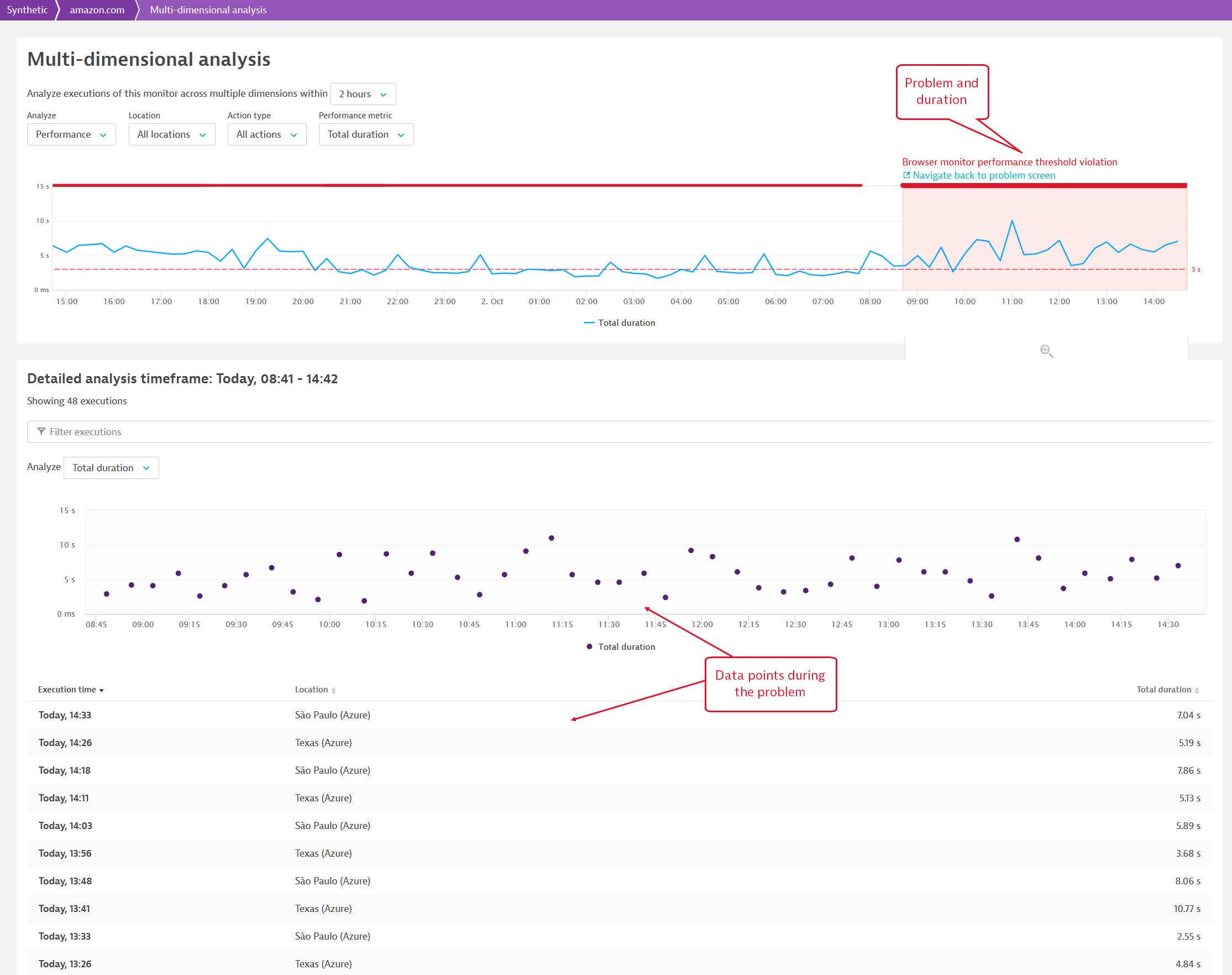
Multidimensional analysis of performance
When you view performance over a selected analysis range, filters enable you to graph performance and filter the corresponding scatter plot and data points along multiple dimensions:
- Location—select all locations or an individual monitor location.
- Action type—view performance for load actions, XHR actions, custom actions, or all actions.
- Performance metric—performance data is captured out of the box for all key performance metrics. While the Synthetic details page graphs performance of one key performance metric per action type, the Multidimensional analysis page shows performance of any metric for any combination of action or action type and location.
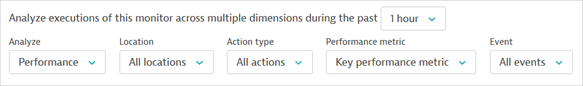
- Event—select all or an individual Synthetic script event. You can only choose an event with timings (an action) from this list; events with no timing data are grayed out.
Scatter plot
While the trend graph at the top of the page can show aggregated data, the scatter plot shows the performance for every data point in the analysis range. The scatter plot always plots performance, regardless of whether you opt to analyze performance, availability, or errors at the top of the Multidimensional analysis page.
Your action type (load, XHR, or all events) selection from the Synthetic details page carries over to the scatter plot. The scatter plot shows the default key performance metrics (specified in monitor settings) for load and XHR actions; if you choose All events in the Synthetic details page, the scatter plot shows Total duration.
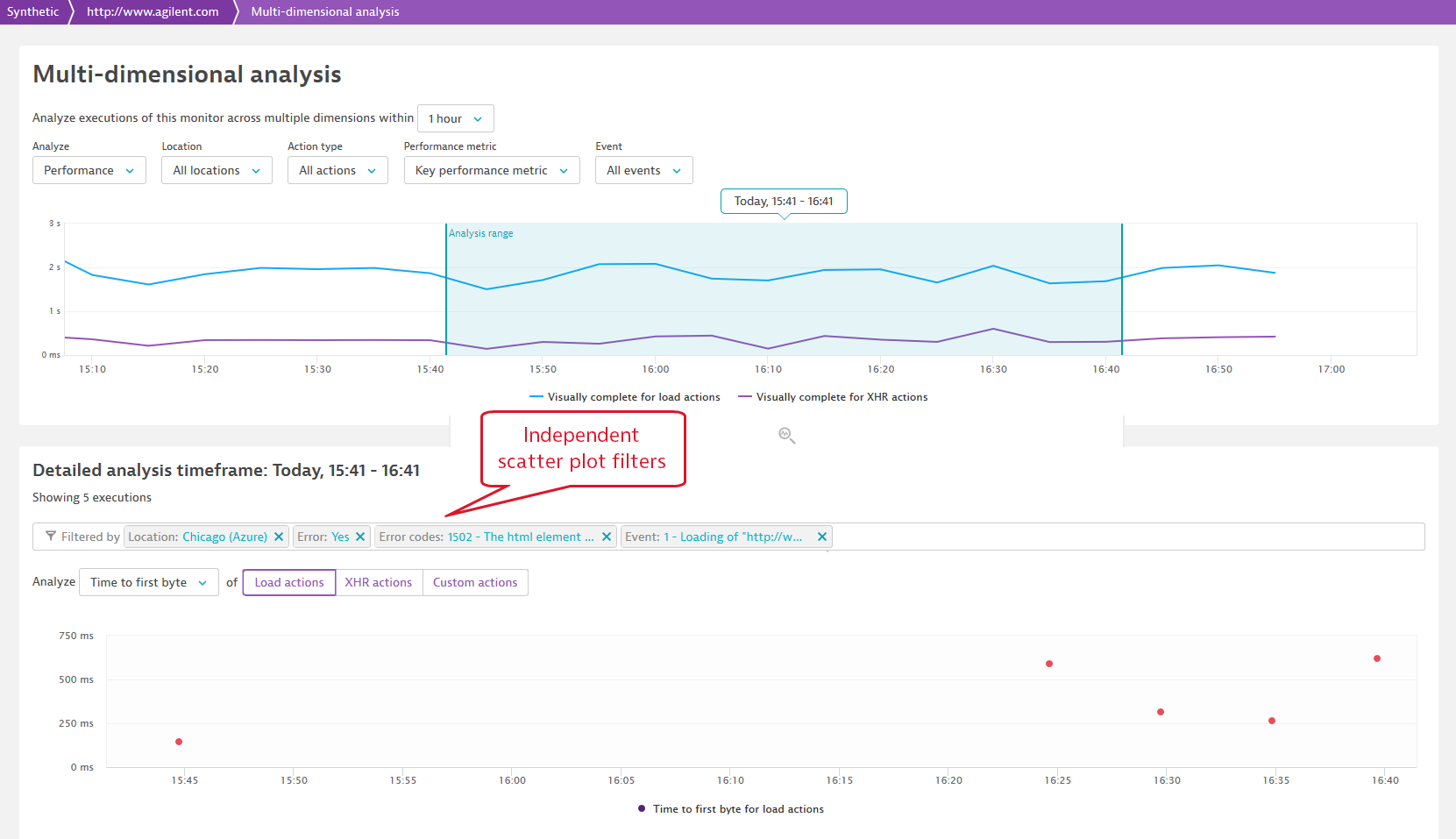
The filters you choose at the top of the page for multidimensional analysis of performance affect the scatter plot. For example, in the image below, the Action type, Performance metric, and Event selections from the trend graph carry over to the scatter plot. (Choosing All actions in the trend graph defaults to Load actions in the scatter plot.)
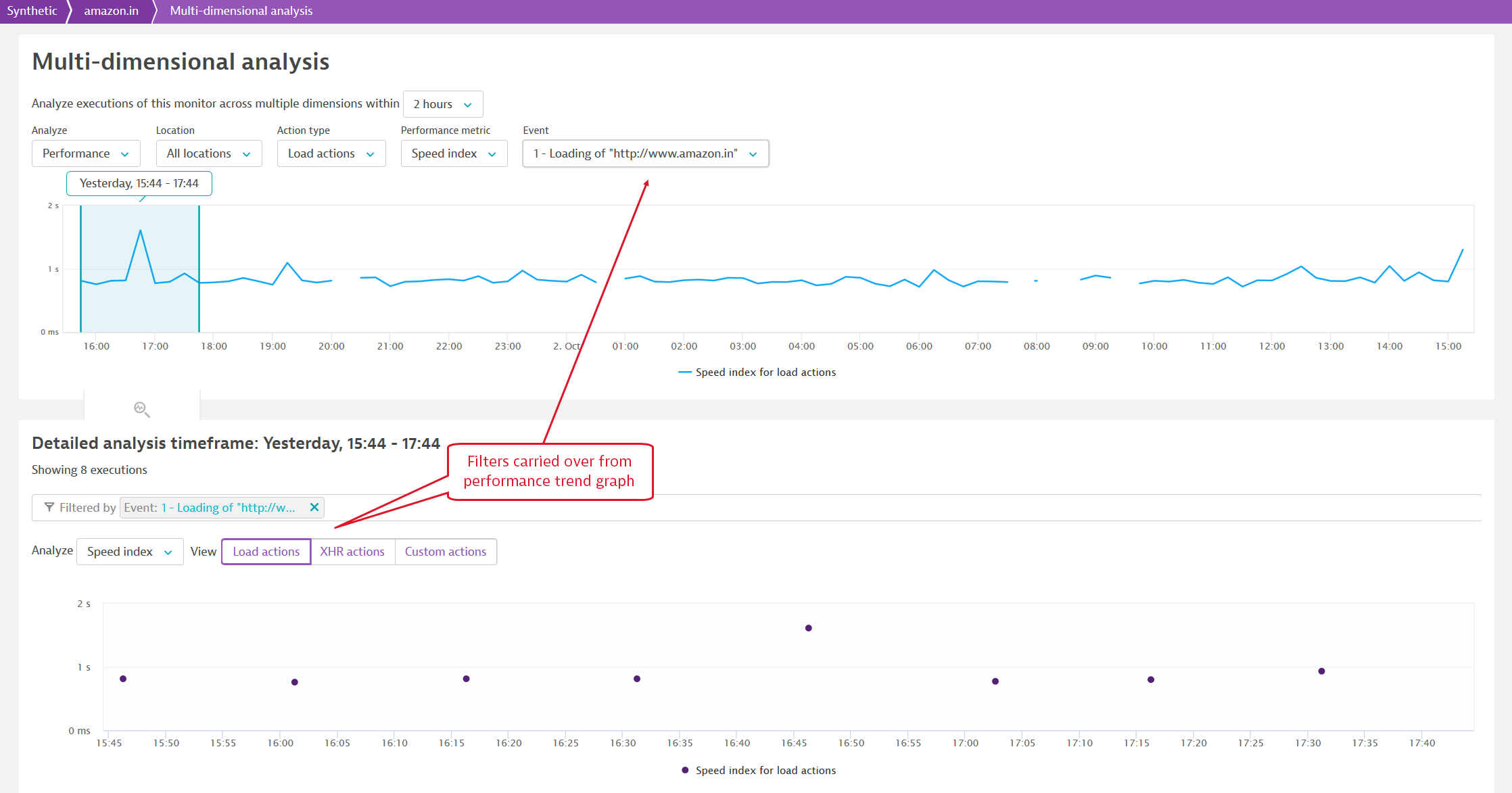
The scatter plot also has its own independent filter for performance metrics, allowing you to view different metrics in the trend graph and scatter plot. What's more, the scatter plot filter contains page-level as well as resource-level metrics. Additionally, you can filter the scatter plot just for Error data points (=Yes), a specific error type (Error codes), Location, and Event. These filters are independent of the trend graph filters.
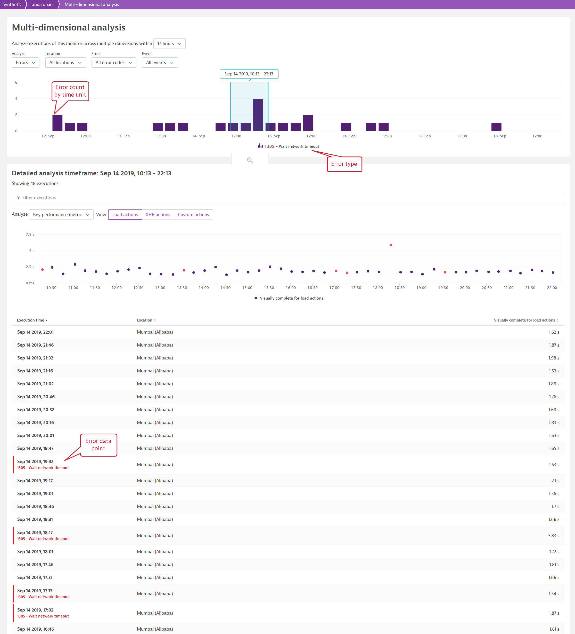
Analyze errors
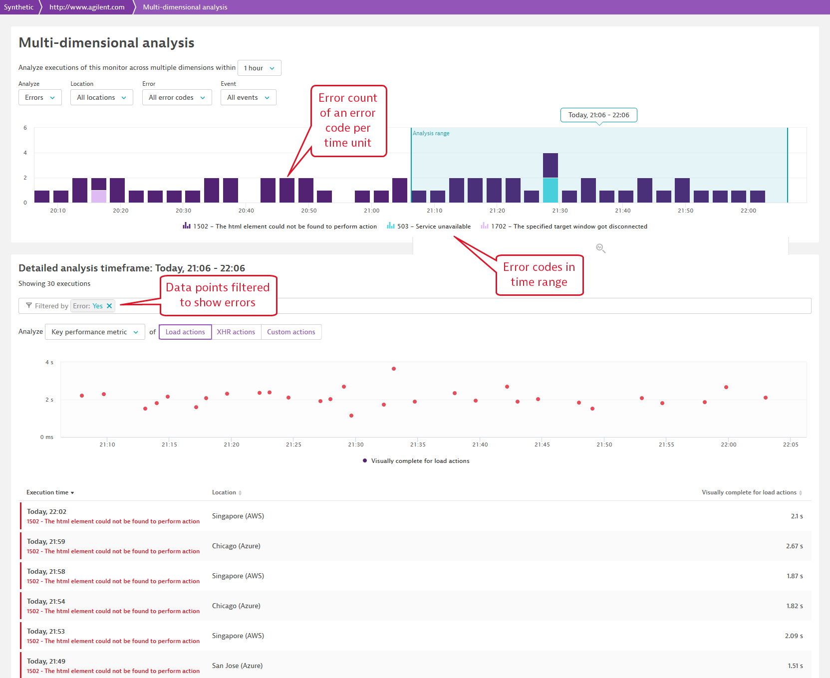
When you click Analyze errors on the Errors card on the Synthetic details page, you're directed to the Analysis page showing a histogram for the error count per unit of time for all locations in the timeframe. The height of each bar represents the frequency of an error code. When you click Analyze  next to an individual error code, you're directed to the Multidimensional analysis page filtered by that error code. Data points are automatically filtered to show only errors; you can remove the filter to view all data points in the analysis range.
Hover over any bar in the graph to see error count for that point in time.
Multidimensional analysis of errors
The following filters are available for multidimensional analysis of errors:
- Location—select all locations or an individual monitor location.
- Error—select all error codes or a single error code.
- Event—select all or an individual Synthetic script event. You can only choose an event with timings (an action) from this list; events with no timing data are grayed out.
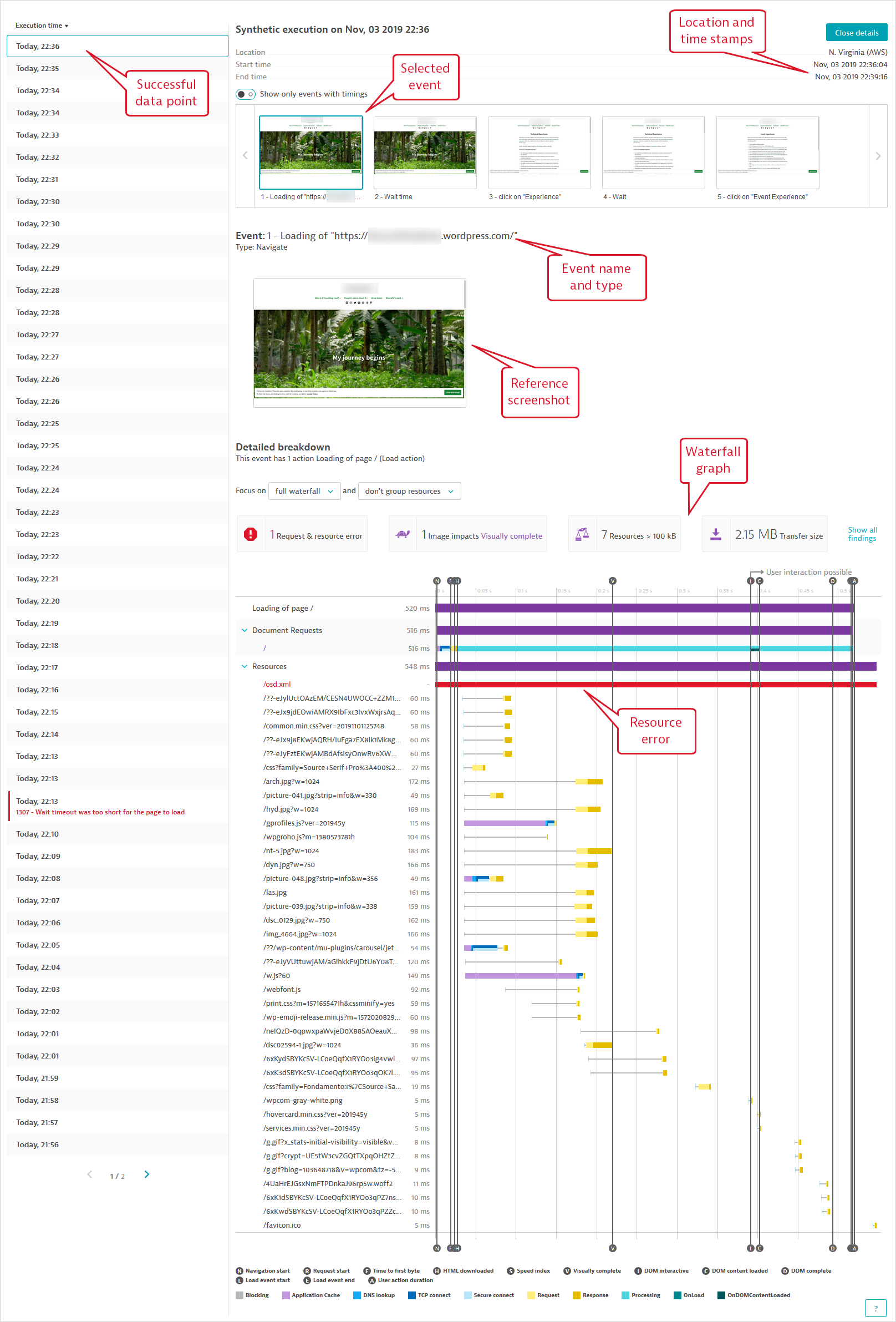
Data points
The Multidimensional analysis page gives you the ability select a specific set of executions within an analysis range, filtered using multidimensional analysis so you can focus on a particular action in a single data point to troubleshoot performance or availability.
The list of data points displayed corresponds to the combination of filters you've chosen for the scatter plot and the multidimensional analysis of performance, availability, or errors.
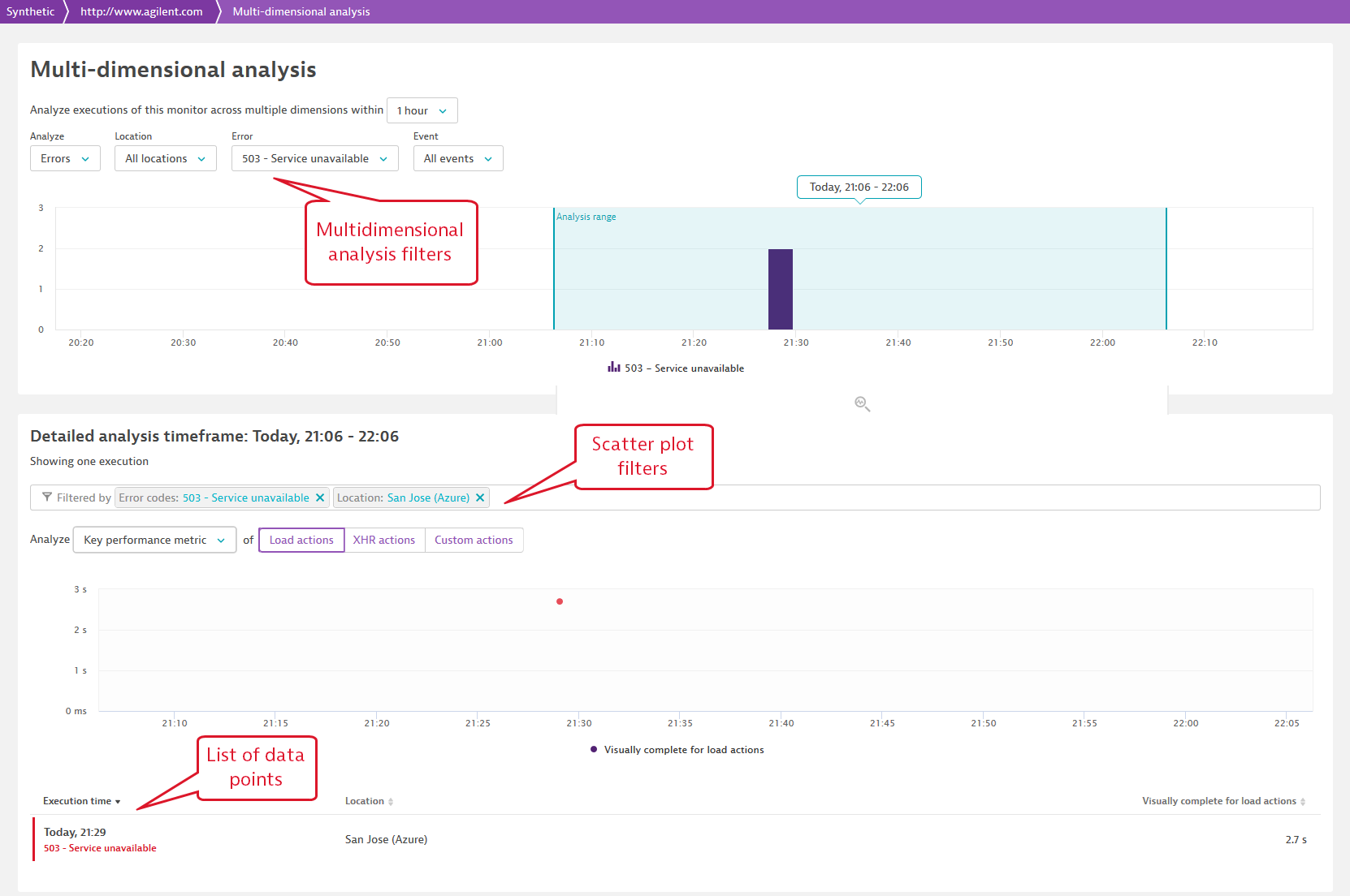
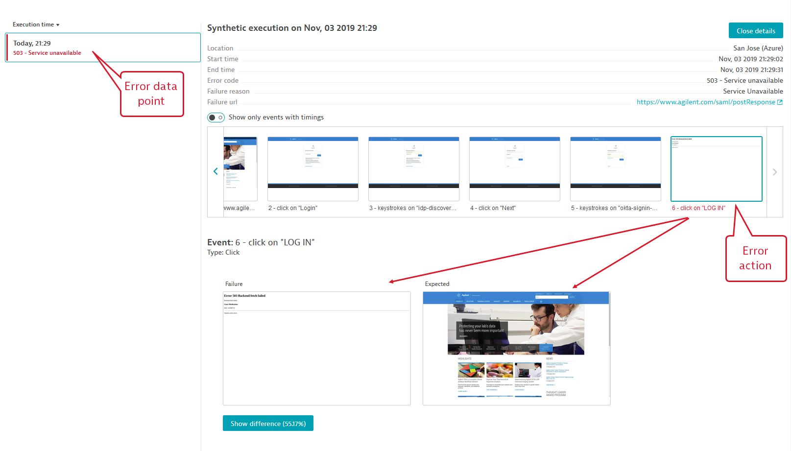
Each data point is listed with its completion time stamp, location, and key performance metric value. Error data points (availability failures) are marked in red and display the error code.
Click a data point to see event-level screenshots and analysis, including waterfall graphs for events with timings (actions). Use the toggle provided to view just events with timings, that is, actions with waterfall graphs. Click Close details to return to the list of data points.
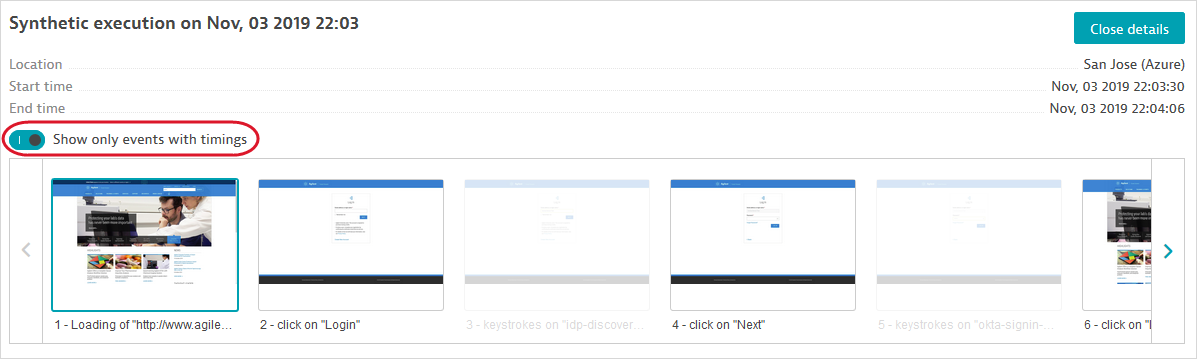
Successful data points display the reference screenshots captured for each event. See the Synthetic details help page for more information on how screenshots are captured.
Note that even successful data points can have actions with individual resource errors, shown in red in the waterfall graph.
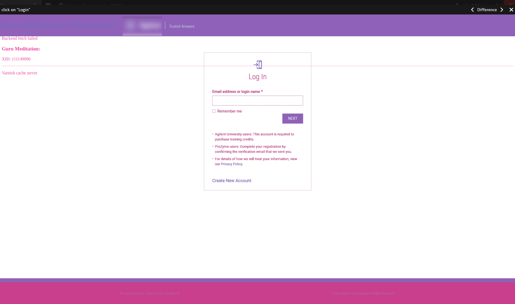
Error data points display screenshots captured during that specific execution, enabling you to compare Failure and Expected (reference) screenshots. The failing data point and action are marked in red. Click Show difference to see the percentage and areas of mismatch highlighted in a superimposed image.