Service response time hotspots
With deep process monitoring enabled, DESK analyzes the response time of each service running within each process. This is applicable to Java, .NET, Node.js, PHP, Apache webserver, IIS, NGINX, and other technologies.
Each Service page enables you to analyze response time hotspots. Response time hotspots indicate which activities are consuming the most time for each service.
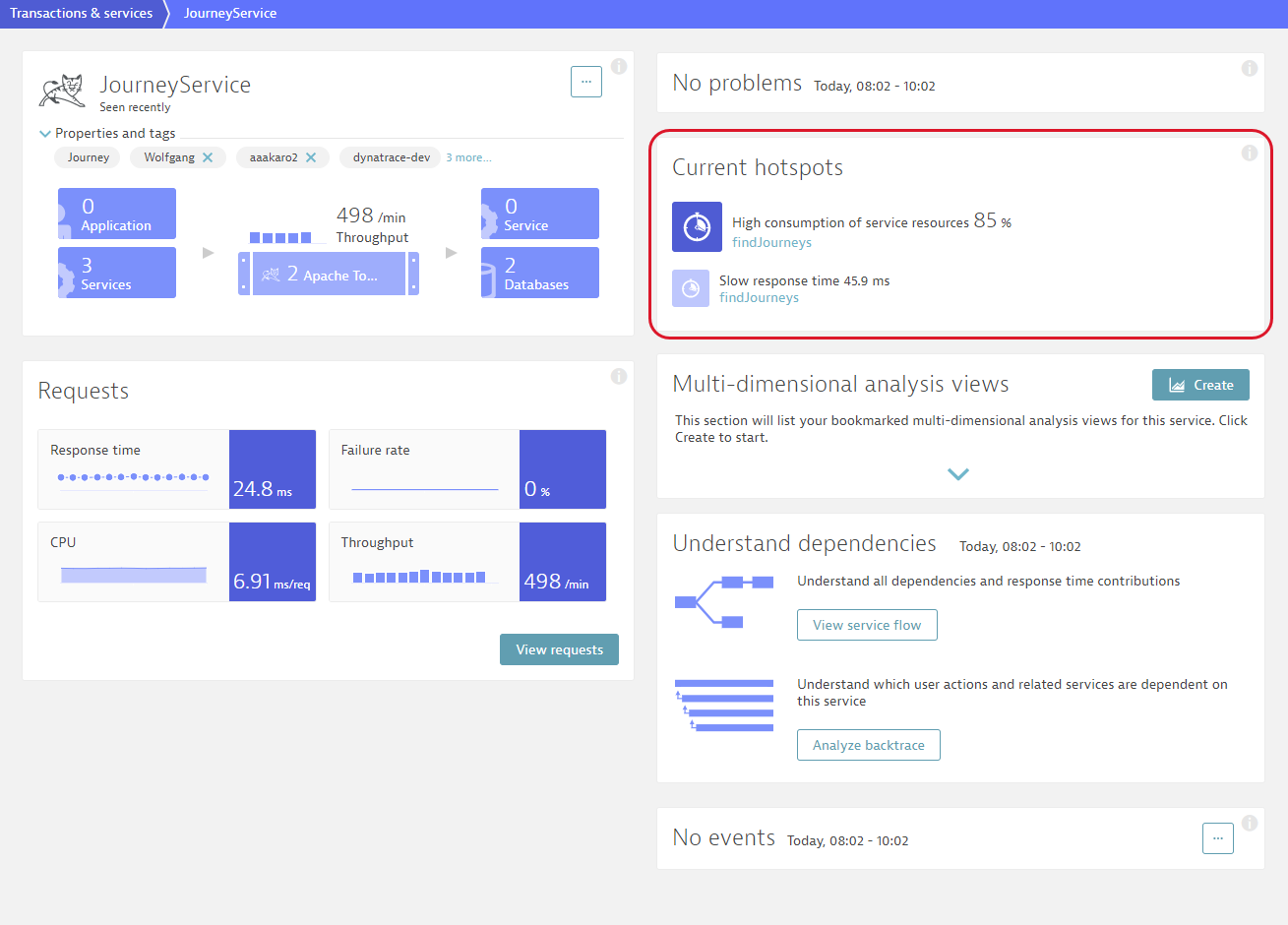
The Current hotspot pane displays top hotspot findings of the service. Requests with slow response time, or high failure rate, or high CPU consumption appear here. The pane also displays requests with high consumption of request resources. The percentage shows the share of the request in the overall response time of the service. In the example below, 85% of the findJourneys service response time is spent on execution of the findJourneys request.
To view the hotspot analysis
- Select Transactions & services from the navigation menu.
- Select the service you want to analyze.
- Do one of the following:
- To analyze a hotspot top finding, click the finding in the Current hotspots to display the details of the service, filtered to the problematic request.
- To analyze all response time hotspots of the service, on the service overview page, click either the View requests, View dynamic web requests, or View resources button. DESK will display the overall details of the service.
- Click the View response time hotspots button to navigate to the Response time analysis page.
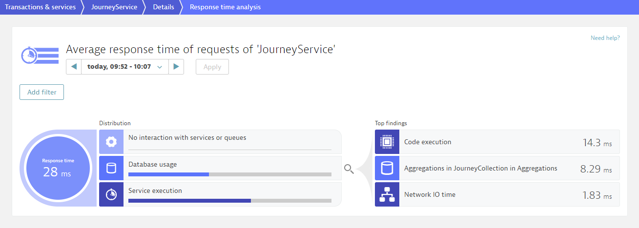
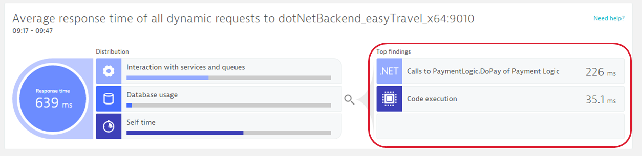
On the Response time analysis page you see the average response time observed during the analyzed timeframe. On the left side of the infographic, under Distribution, you can see how much time is contributed by calls to other services, calls to databases, and code-level execution. On the right side, under Top findings, we list the biggest hotspots identified by DESK. You can click any of these entries to view further details.
Calls to other services
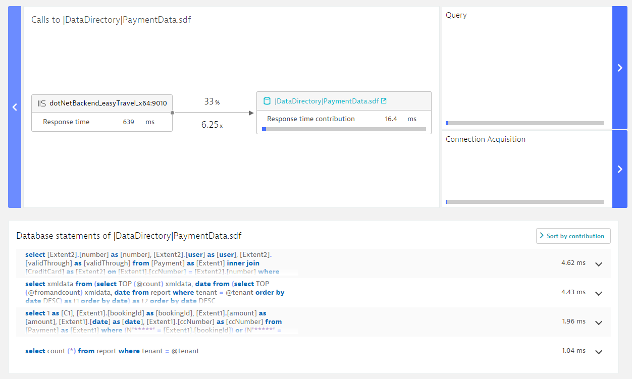
Click Interaction with services and queues to display details regarding how these calls contribute to the overall response time.
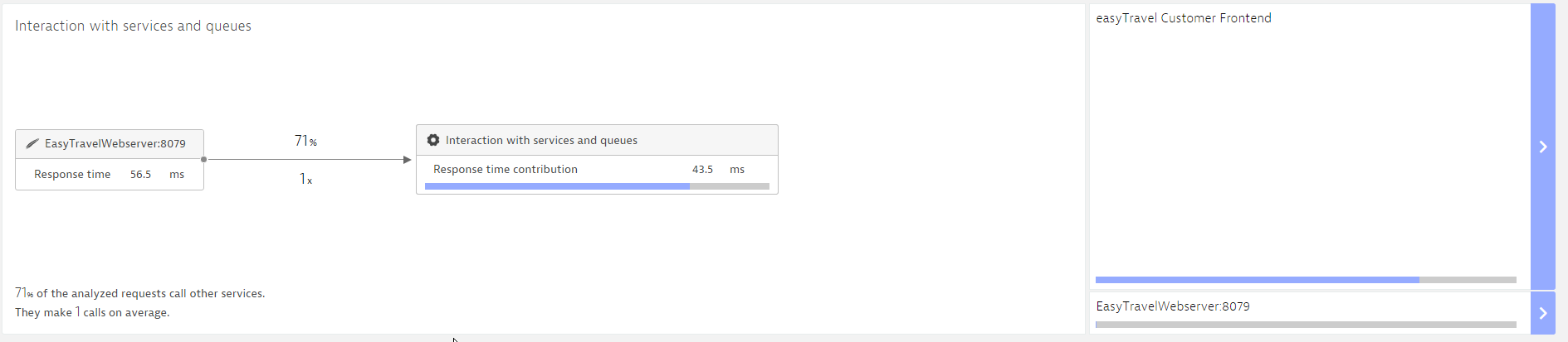
On the left side you see how often the analyzed service calls other services and to what extent these calls contribute to the response time. On the right side, this information is broken down into more detail. In the example above, you see that most of the time is contributed by the Easytravel Customer Frontend service. Click the service name to view the next step in the hierarchy. Once you reach the lowest level (the request level) you see full response-time details for the selected request.
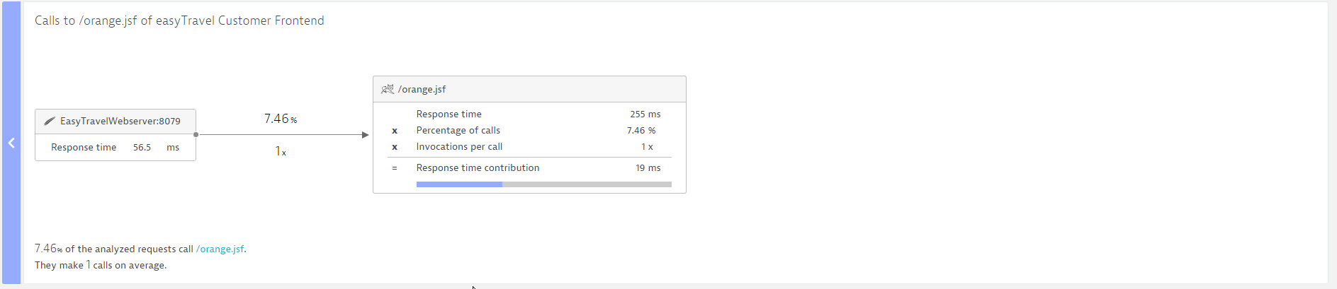
In the example above, we see that EasytravelWebserver:8079 calls the URL /orange.jsf on easytravel Customer Frontend in only 7.46% of the overall requests it initiates—exactly once each time. We see that the response time of /orange.jsf is 255 ms on average. However, because this is called only rarely, it contributes only 19 ms to the average response time of EasytravelWebserver:8079.
If you click the arrow button on the left boundary of the Interaction with services and queues section, you can again move upwards in the hierarchy.
Database requests
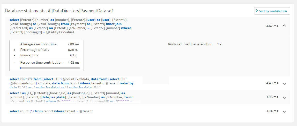
Click the Database usage portion of the infographic to access details about the database requests of the analyzed service and to see how they contribute to the response time. The top section offers the same navigation and information offered by the Interaction with services and queues section. Beneath this you can view all database requests.
By clicking the list box in the top right corner, you can sort database statements by average execution time, percentage of calls, invocations, and contribution. By default, the statements that contribute the most to response time are included at the top of the list. Click a SQL statement to view the values for these four attributes.
Code-level visibility
Click Service execution to view how much time the service spent executing its own code.
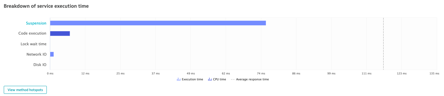
The lengths of the bars represent the amount of time spent in each particular area. The dark blue color represents CPU time. Click any row name that's rendered as a link to view the related method-level hotspots.
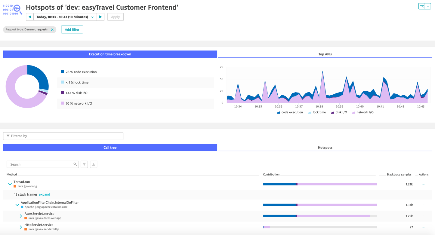
Click the View method hotspots button and check all the classes and methods that were executed to run the service under the Call tree section. The Stacktrace samples column shows how many times the class/method was executed for the service during the selected timeframe. The Contribution column shows the share of consumption that the class/method contributes to the overall execution. This allows you to identify which class and/or method is consuming most of the execution time and subsequently optimize the code.
Automatic Hotspots
The Top findings section of the Response time analysis infographic lists the hotspots that are the key contributors to the analyzed request.
If a request is slow, you'll see the underlying cause listed under Top findings. Click a finding to view further details. In this example you can see that 226 ms out of 639 ms were spent in a call to PaymentLogic.DoPay!
Response time distribution
Click the circular Response time portion of the infographic to open a chart that shows the response time distribution of all analyzed requests. This shows you if your service has a range of response times or if it performs uniformly.
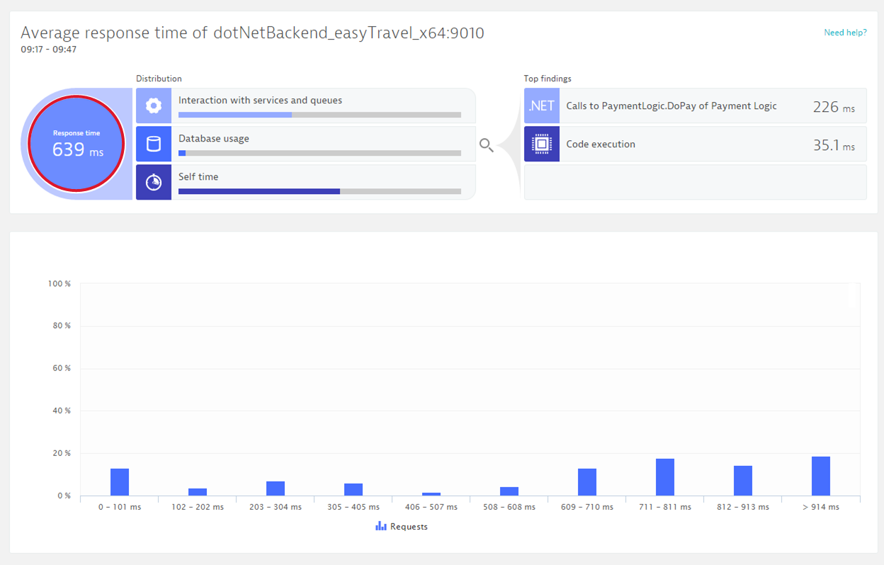
Typically, web-request services have a wide range of response times. Analyzing a single request often shows a more uniform picture.