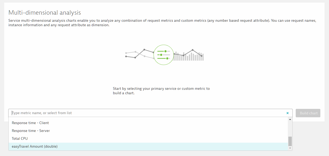
Create custom charts based on request attributes
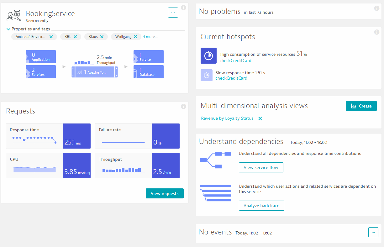
DESK allows you to use data captured via request attributes to build your own custom analysis charts. When you go to any Service page, you’ll find a section called Multidimensional analysis views. Click the Create button to get started.
This view is similar to the custom charting view and, indeed, this feature relies on the same underlying functionality. However, multidimensional analysis views deal with service request data directly.
You can select any metric that’s available for a service: Response time, Failure rate, or Total CPU. What’s more, you can chart any numerical request attribute.
Once you select a base metric to chart, you can freely select other dimensions to add to the chart. This includes the request name and service instance itself, but also any available request attribute.
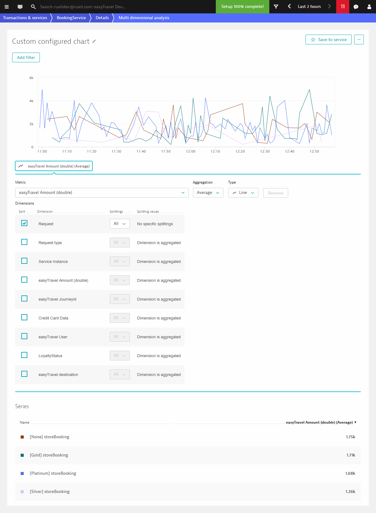
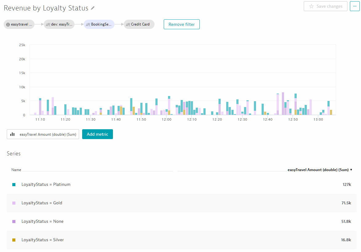
So, instead of the request name itself, you can choose Loyalty Status and track revenue based on this dimension.
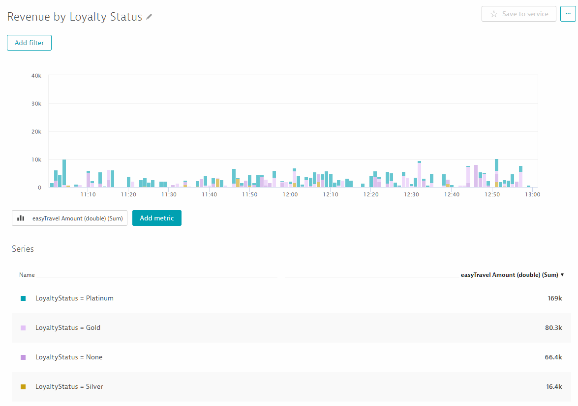
Finally, give the chart a name (Revenue by Loyalty Status in this example) and press Save. The result is a custom analysis view that appears directly on the service overview page.
The potential use cases for this functionality are vast. Not only can you select any metric or numerical request attribute for charting, and any attribute as a dimension, you can also chart two metrics for comparison in the same chart. Most significantly, this chart is based on the data of a single end-to-end transaction, and therefore it features the complete set of possibly defined filters.
In the example below, a filter is added that ensures that the chart only displays online revenue that’s paid via Credit Card by users paying via the easyTravel Web site.
Of course, this charting functionality isn’t restricted to business use cases—you can build your own request-metric based analysis views for performance analysis as well here.
Service instance or Top X request charts
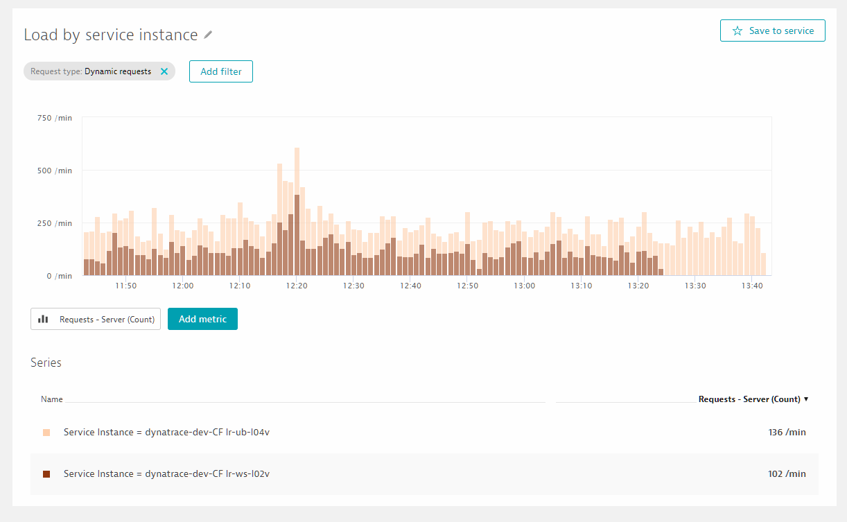
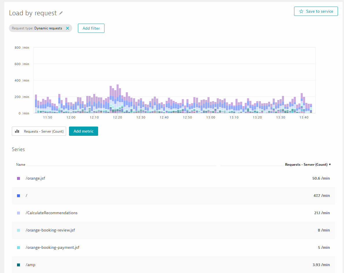
Another use of this feature is that you can easily create response time charts on a per cluster-node basis. The service example below features two instances on two different hosts. Notice the Create chart button in the Service instances section of the page.
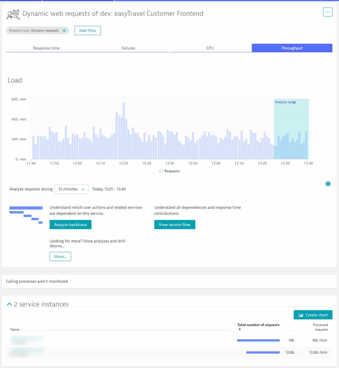
Clicking the Create chart button produces a chart for the current metric, Throughput in this case, split out by service instance.
And, you can do the same in the request table...
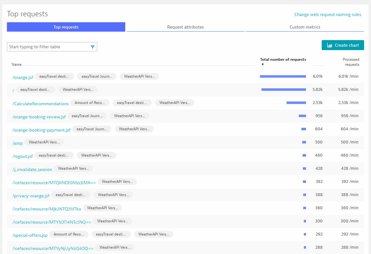
…to chart the top request.
Of course, you can modify this chart to your liking by adding additional metrics or dimensions.