Service analysis types
Click the services tile on the home dashboard to go to the Service list. From the Service list, click a service to view that service's dedicated Service page.
Service infographics
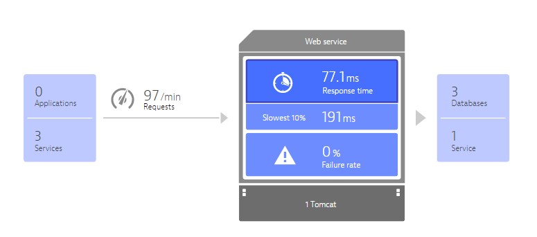
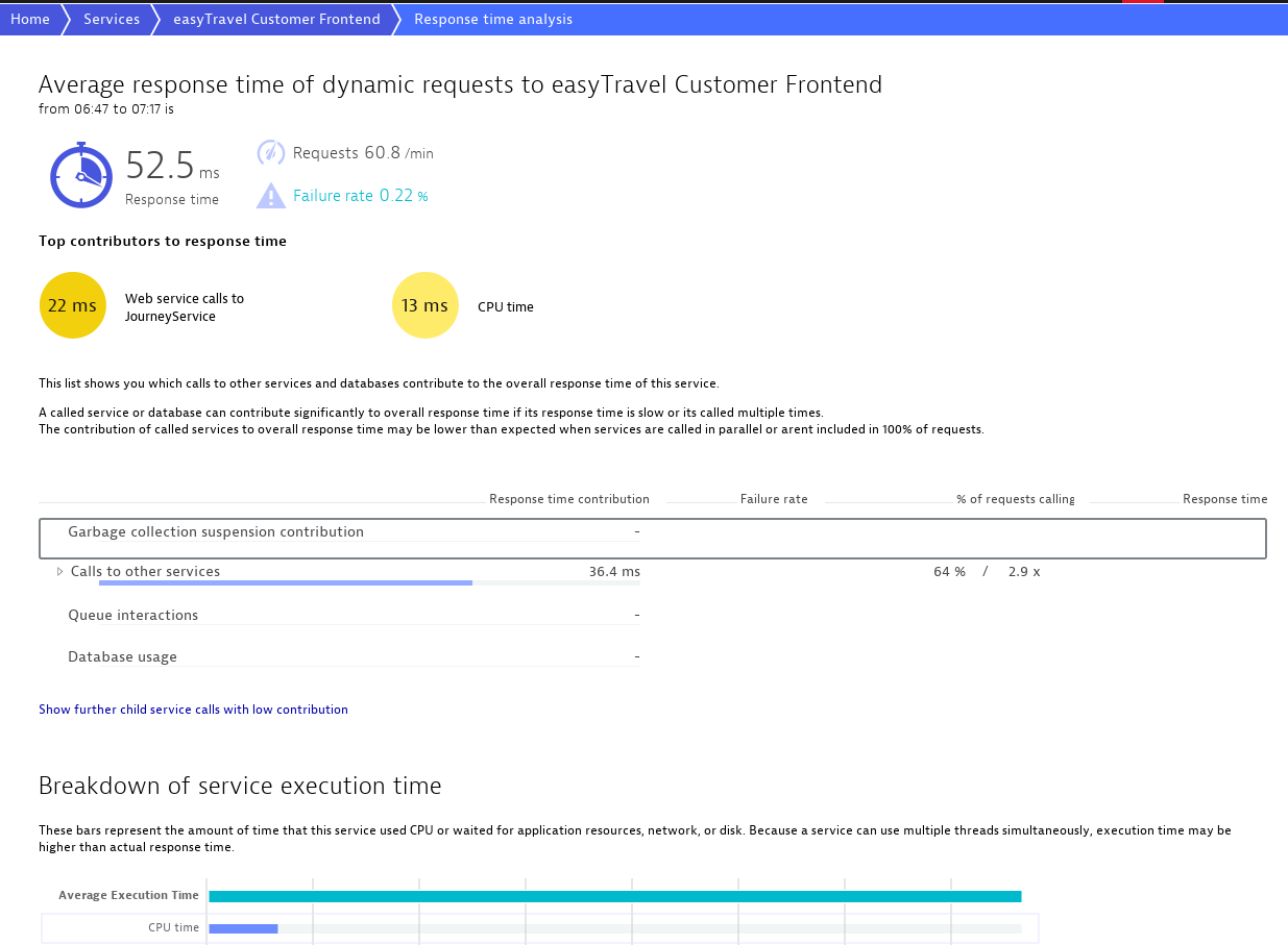
Each Service page lists the most important metrics for that service in an intuitive infographic. Each service infographic shows you which applications or services use the service and if the service makes any calls to other services or databases.
Each area of the Service infographic serves as a link you can click to view greater detail, for example additional charts or specifics regarding inter-service communication. For example, to access detailed response time and failure rate charts across time for the selected service, click the Response time, Slowest 10%, or Failure rate areas of the service infographic.
The Applications and Services that utilize the selected service are depicted in boxes on the left side of the infographic. The Databases and Services that the selected service itself calls are depicted on the right. Click areas of the service infographic to view response time, failure rates, and more for any service.
Response time analysis
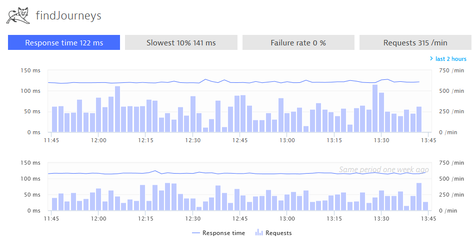
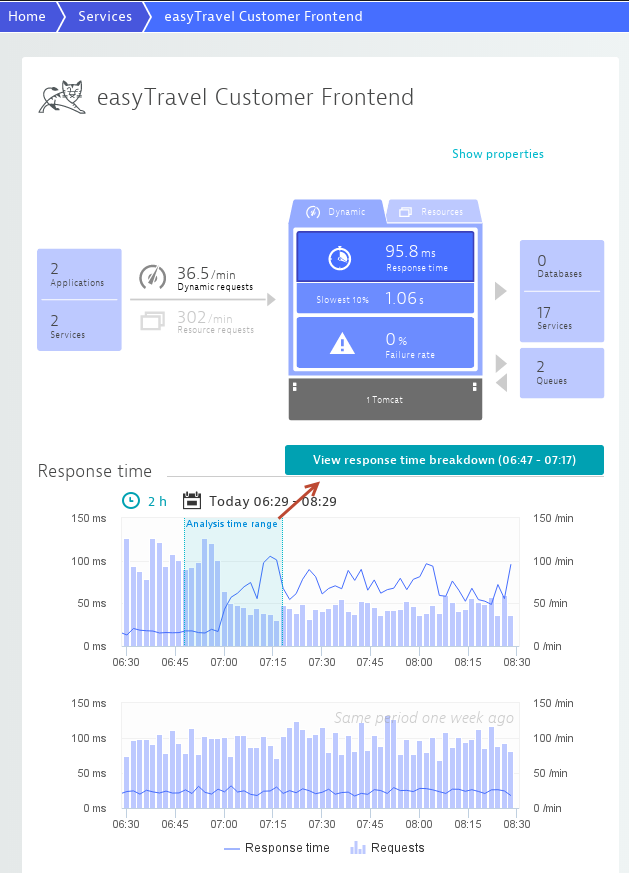
The charts on each Service page feature an Analysis timeframe slider control to help you analyze response-time spikes. The analysis timeframe selected with the slider is reflected on the View response time breakdown button underneath the chart.
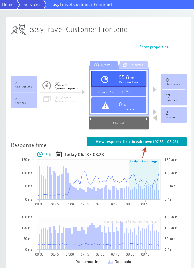
You can change the selected timeframe simply by clicking different points in the chart timeline. Notice that the timeframe displayed on the View response time breakdown button changes when you do this.
Click the View response time breakdown button to analyze the selected timeframe in detail and to view response time hotspots (i.e., top contributors to service response time).
This feature works on all Service charts (Response time and Failure rate) and service method charts (Response time, Failure rate, and CPU consumption).
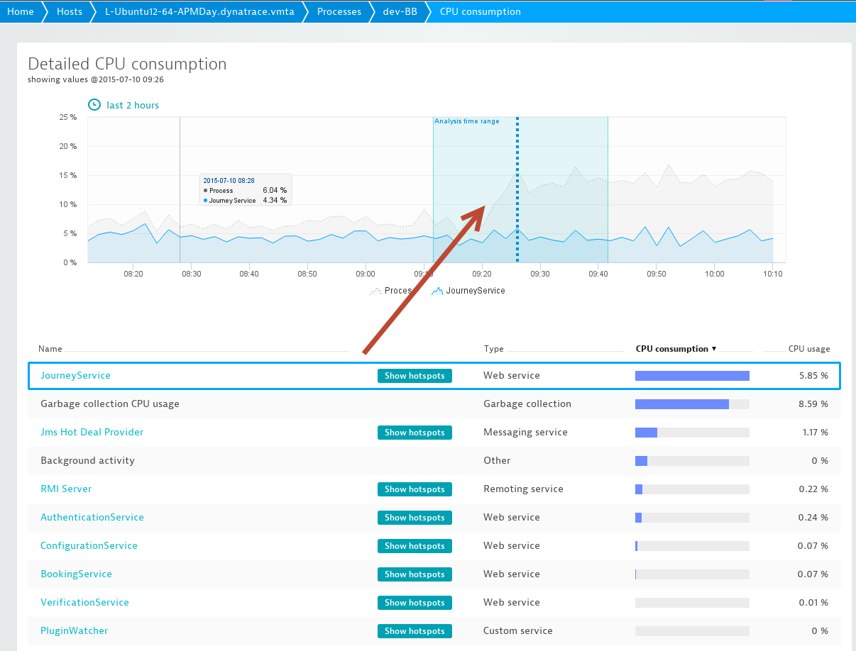
It also works on each process Detailed CPU consumption chart.
Automatic hotspot analysis
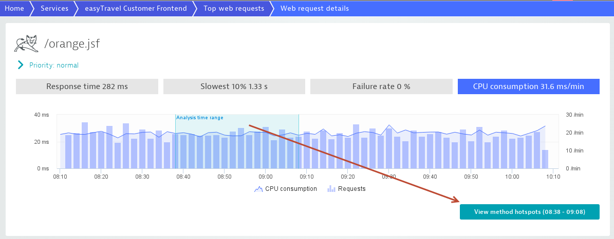
The hotspots section of each Service page is dynamic and automatically displays the most important hotspots in your service. Ever wonder which of your requests are the most CPU intensive requests, are the Most time consuming requests, or are the Slowest requests. This information is gathered and displayed for you automatically.
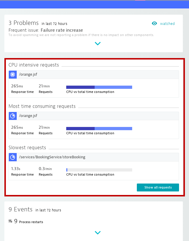
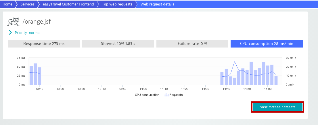
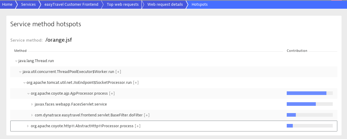
Click any hotspot entry to begin deeper analysis. In the example above, DESK shows you that the most CPU intensive request is the /orange.jsf request. Clicking this entry takes you to a chart that displays overall CPU consumption of this request (shown below). This represents all the CPU cycles that requests of this type consume in your Web server cluster. Click the View method hotspots button to view CPU level hotspots in your code. This is all just two clicks away from each service page.
Of course monitoring isn't only about resource consumption. Errors are a greater concern. As such, DESK immediately informs you of all requests that have high failure rates.
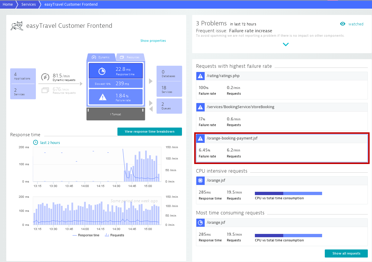
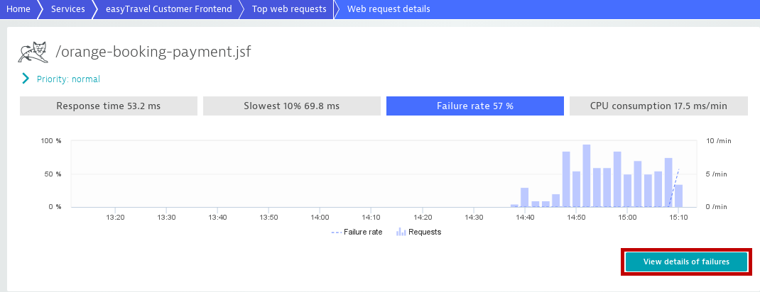
Clicking a request shows you the Failure rate chart for that particular request. Here again you have the option of investigating the root cause of the failures. Just click the View details of failures button.
In this example, DESK shows you that the request failures are the result of problems with another service, BookingService.
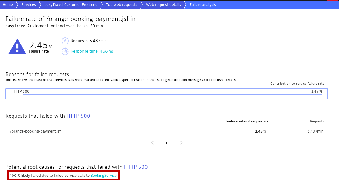
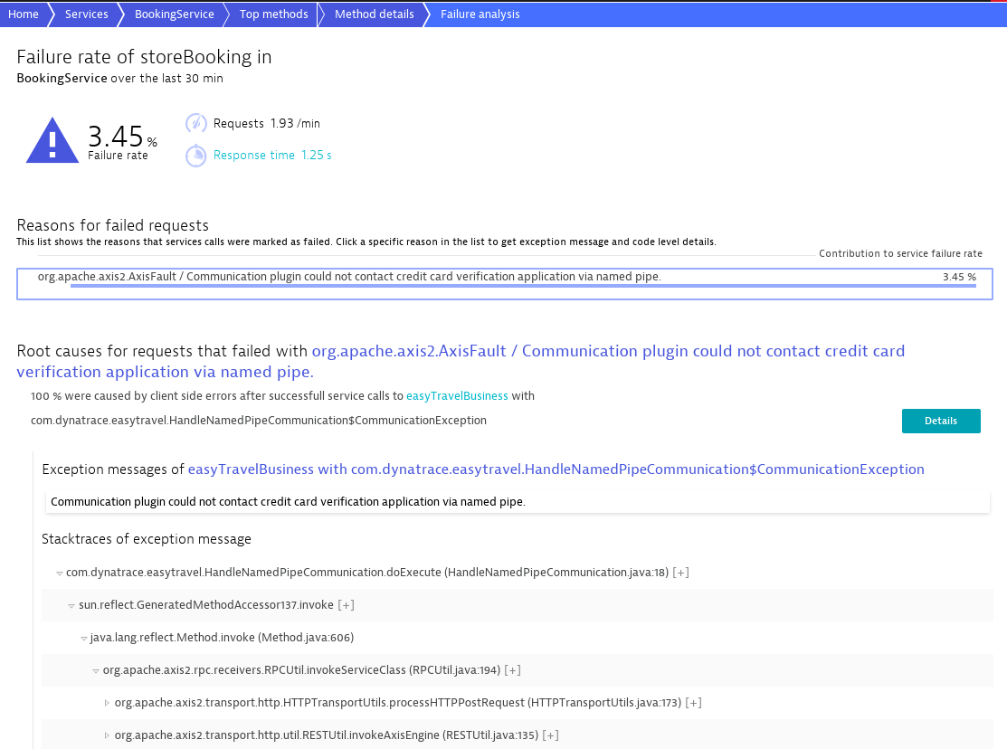
If you take the next logical step, down to the exception stack trace, you'll see the root cause of the failures—source code line information included.
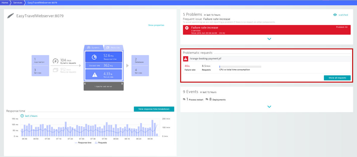
When viewing a service page, any Problematic requests related to the service are displayed in the right-hand column.
And when using DESK in the context of analyzing a problem, all requests that contribute to the problem display.
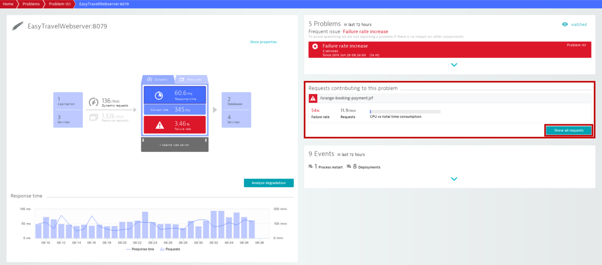
To view the Top requests associated with each service, click the Show all requests button.
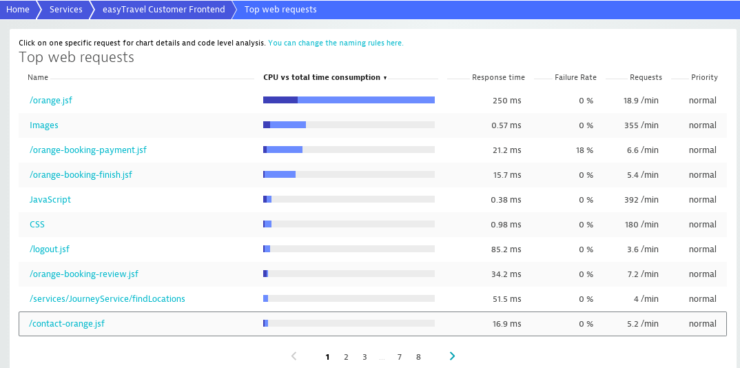
Click any of the listed requests to get the specific charts and analyze its response time or failure rate.