Use filtering to create sophisticated charts
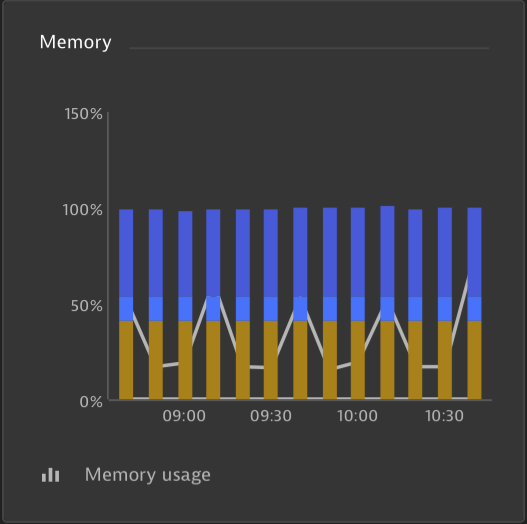
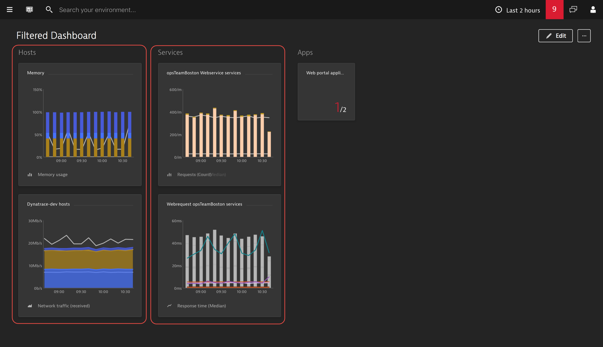
DESK provides powerful filtering options that enable you to set up custom dashboards in support of the unique monitoring needs of each of your organization's teams. This topic explains how to create a custom dashboard, similar to that shown below. Have a look at the two chart tiles in the middle Services dashboard column in the example below. These tiles highlight two metrics [Requests (count) and Response time (median)] of a service that is the responsibility of an Operations team called opsTeamBoston. Also, note the two tiles in the Hosts column on the left. The charts on these tiles [Memory usage and Network traffic (received)] display custom metrics related to specific hosts that reside in the same data center.
Use filters to customize charts on your dashboard
You can set up custom filtered charts for specific hosts, services, databases, or other entities in your environment. In this example, we'll create a custom chart that focuses on key metrics for a specific host.
To create a new dashboard
- Select Dashboards from the navigation menu.
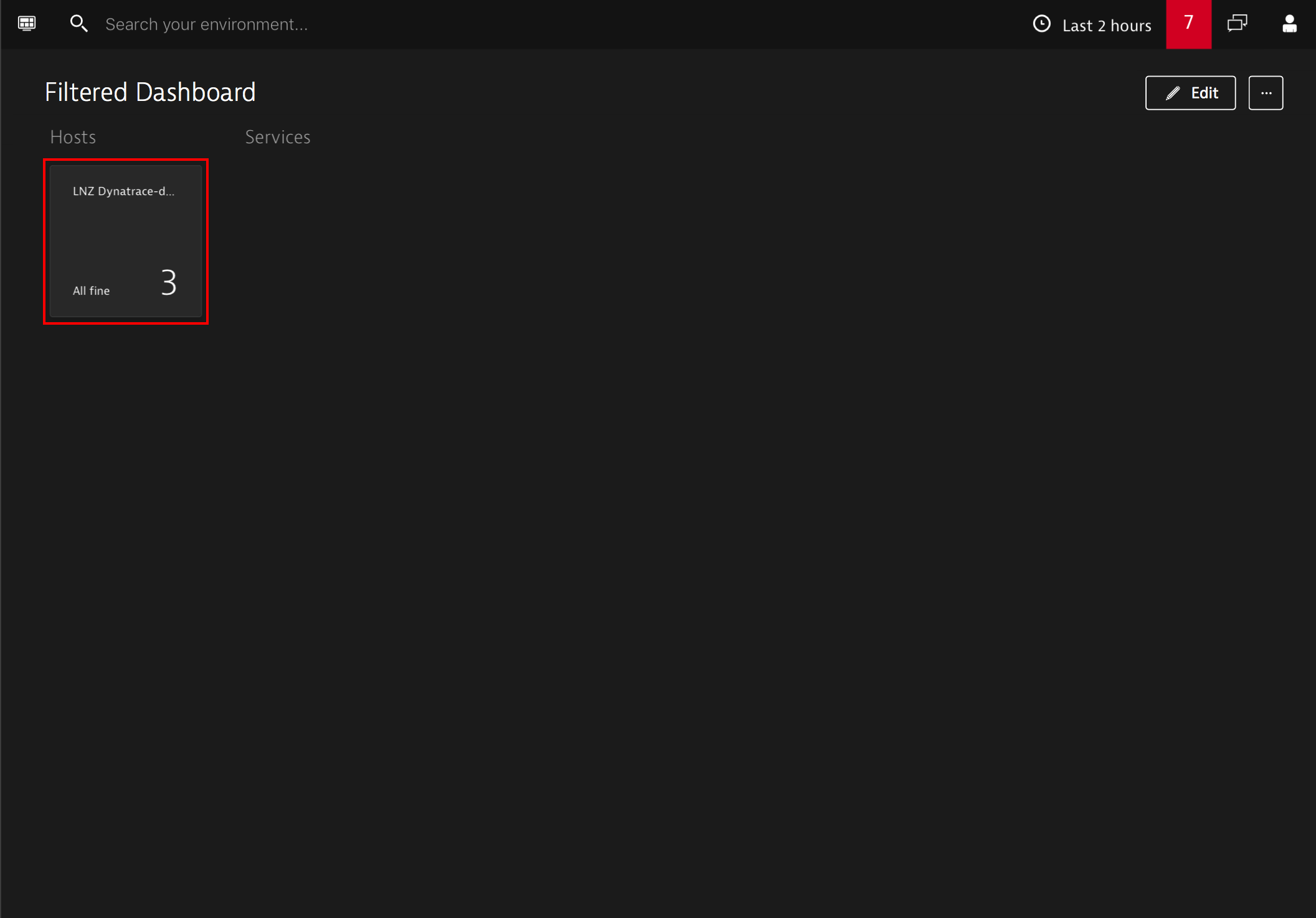
- Click the Create dashboard button. For this example, we'll create a new dashboard called Filtered Dashboard that relies on custom tags to display hosts that are the responsibility of a specific team.
- Type in a Dashboard name and click Create dashboard.
- Click Done.
Add filtered charts
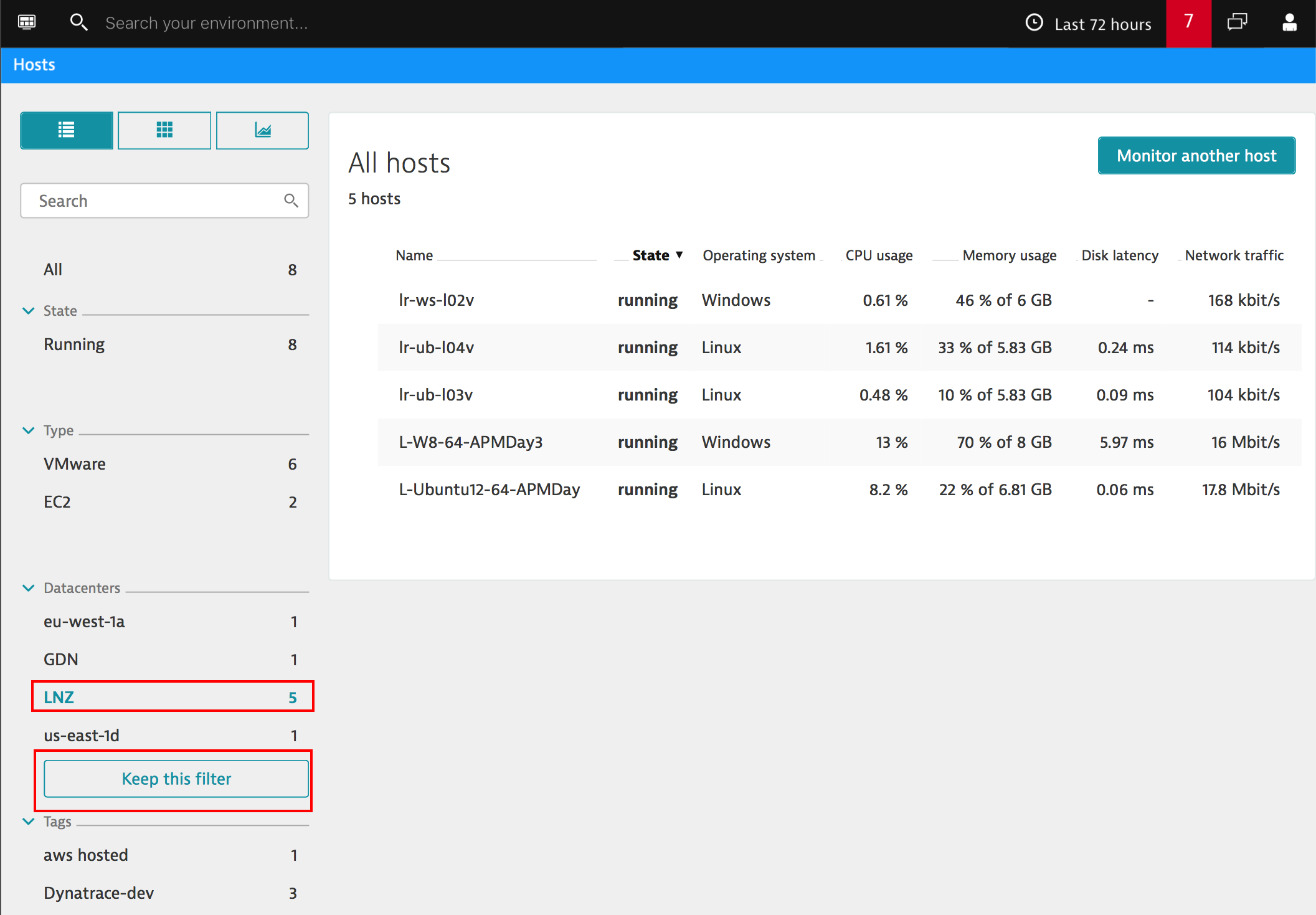
- Because we want this dashboard to focus on the key metrics of a specific host, we'll begin by selecting Hosts in the navigation menu.
- For this example, we'll select the LNZ data center. Note that selecting an attribute from this list filters the Hosts list. Also, a Keep this filter button is displayed, giving you the option of saving your selection as a custom filter. Depending on your needs, you can combine multiple such filters into a single filter.
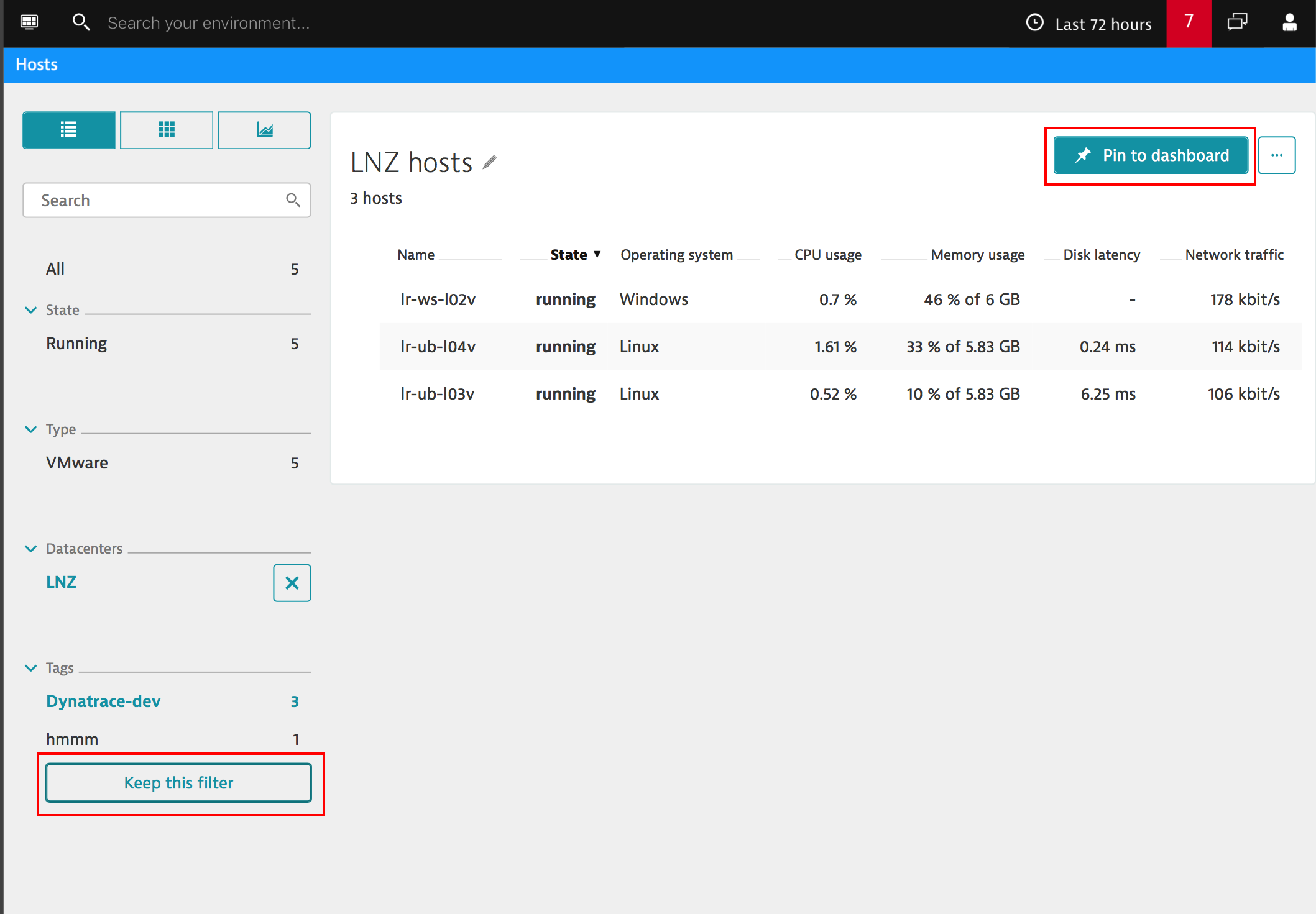
- Click Keep this filter.
- Click Pin to dashboard to create a tile that's specific to the hosts in the LNZ data center. As you might expect, this filter is fully dynamic. If hosts are added or removed from the LNZ data center, this list will be updated automatically.
- Your filter is now saved to your new dashboard as a tile (see below). Now let's add some custom metrics to this tile. Click the new LNZ tile to return to the filtered list of hosts.
- Click the new Chart button at the top of the filter list (see below) to access the charting functionality.
- The Add metric button enables you to build complex charts that can display up to two different metric chart types at the same time. Click Add metric to display the list of metrics that are available for this set of hosts.
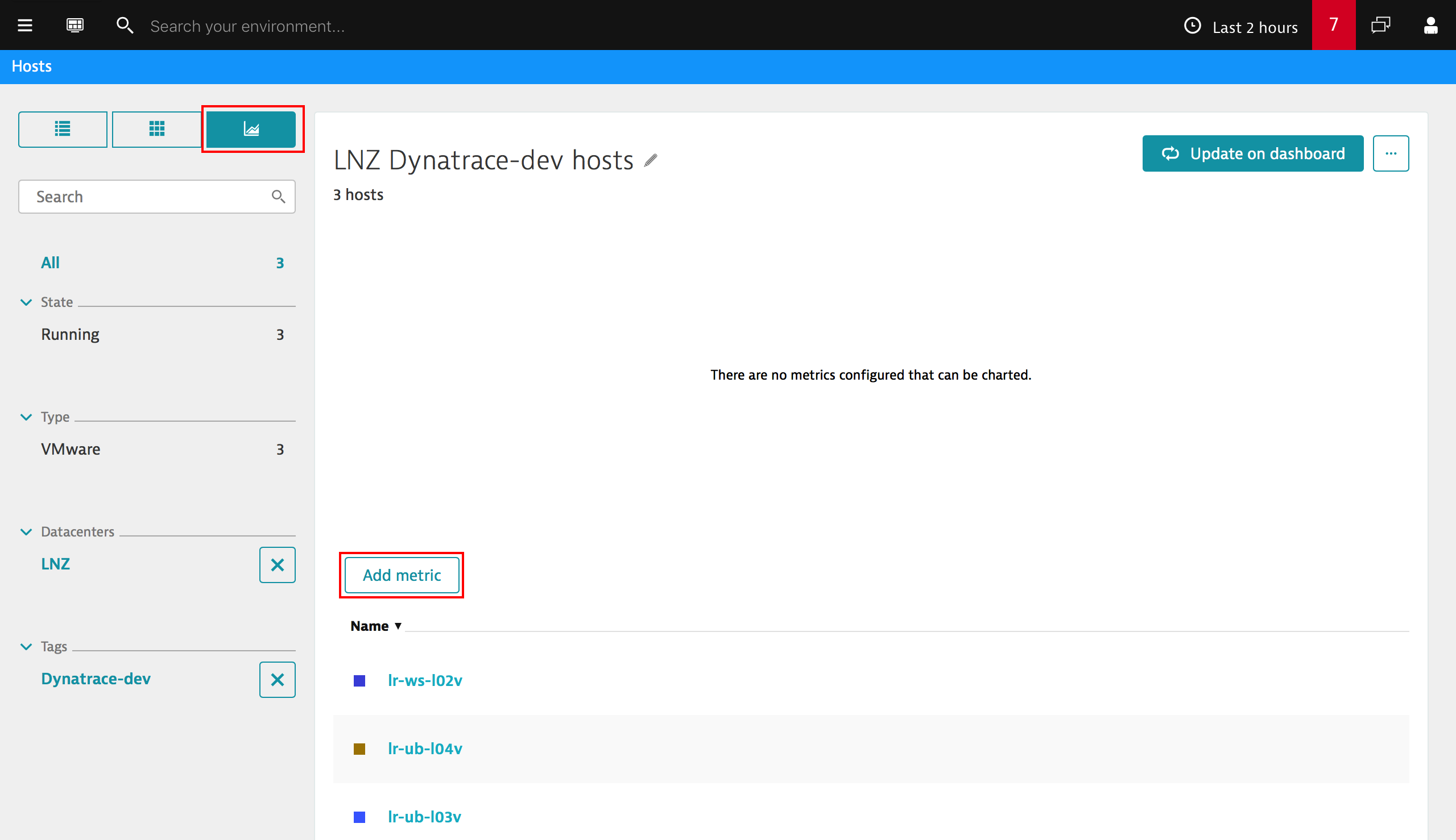
- For this example, we'll select the Page faults and Memory usage metrics for display on the LNZ hosts tile. Select these metrics from the Add metrics drop list.
- Select the chart type to be displayed and then click Add to add these metrics to your dashboard tile.
- Click Update on dashboard to save the changes to your dashboard tile.
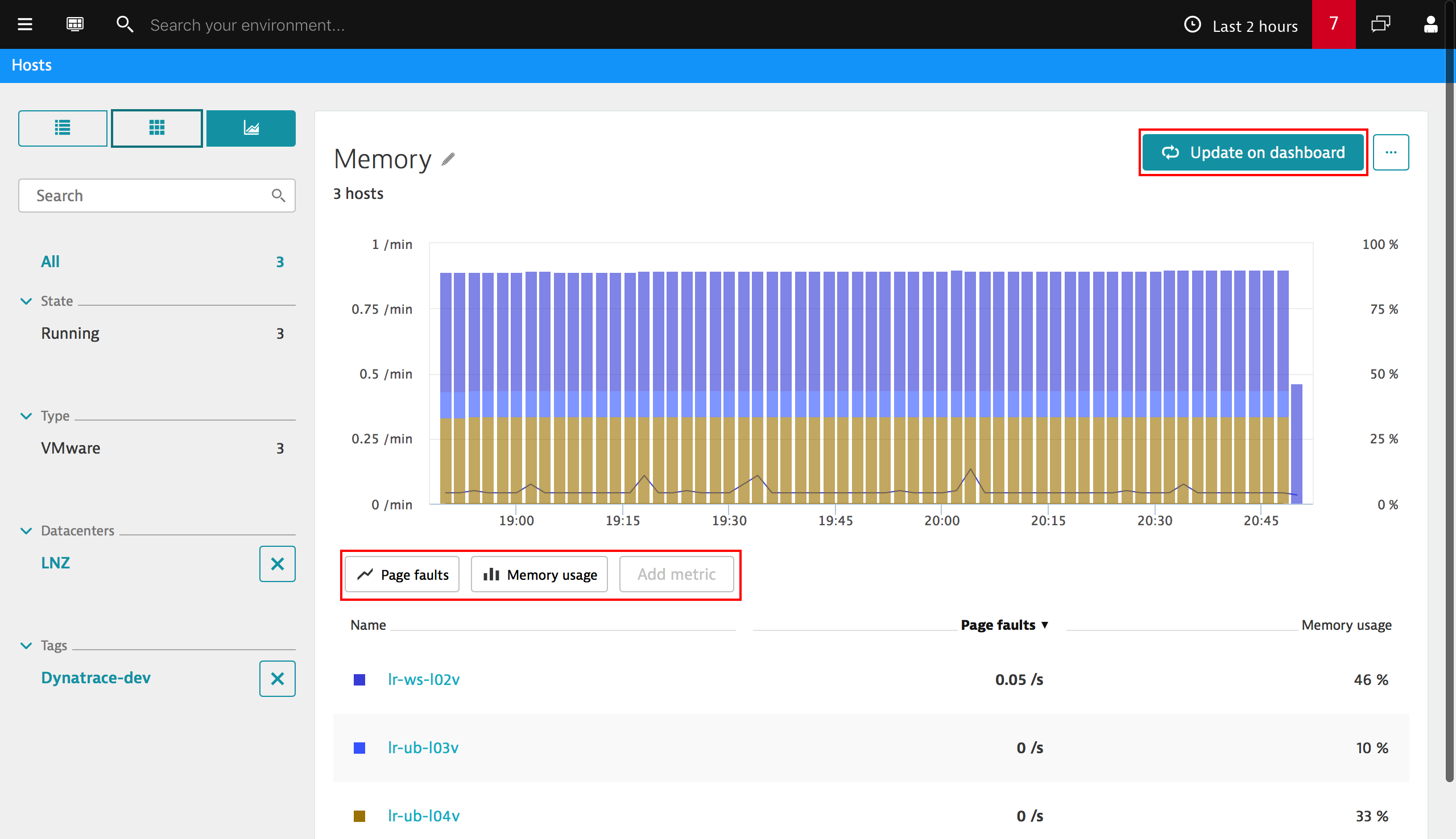
- You now have a custom tile on your new dashboard that displays the Page faults and Memory usage metrics related to all hosts residing in the LNZ data center!